Letter Four
Premium design-build firm lost in a massive crowd.
Jeremy Baker and Lauren Adams had built Letter Four into one of LA’s few authentic design-build firms. But after 14 years of building stunning homes and commercial spaces, nearly every other contractor in their region was flying the design-build flag – even GCs that outsourced design.
Sticker shock killing potential deals after preliminary pricing
Disconnect between exceptional work and average branding
Ineffective messaging across all touchpoints
Founder dependency limiting growth potential
Revenue plateaued despite 20% growth targets
Scope
Brand Strategy
Visual Identity
Copywriting
Art Direction
Illustration
Print Collateral
Environment
Signage
Web Design
Contributors
Photography:
Marcelo Coelho
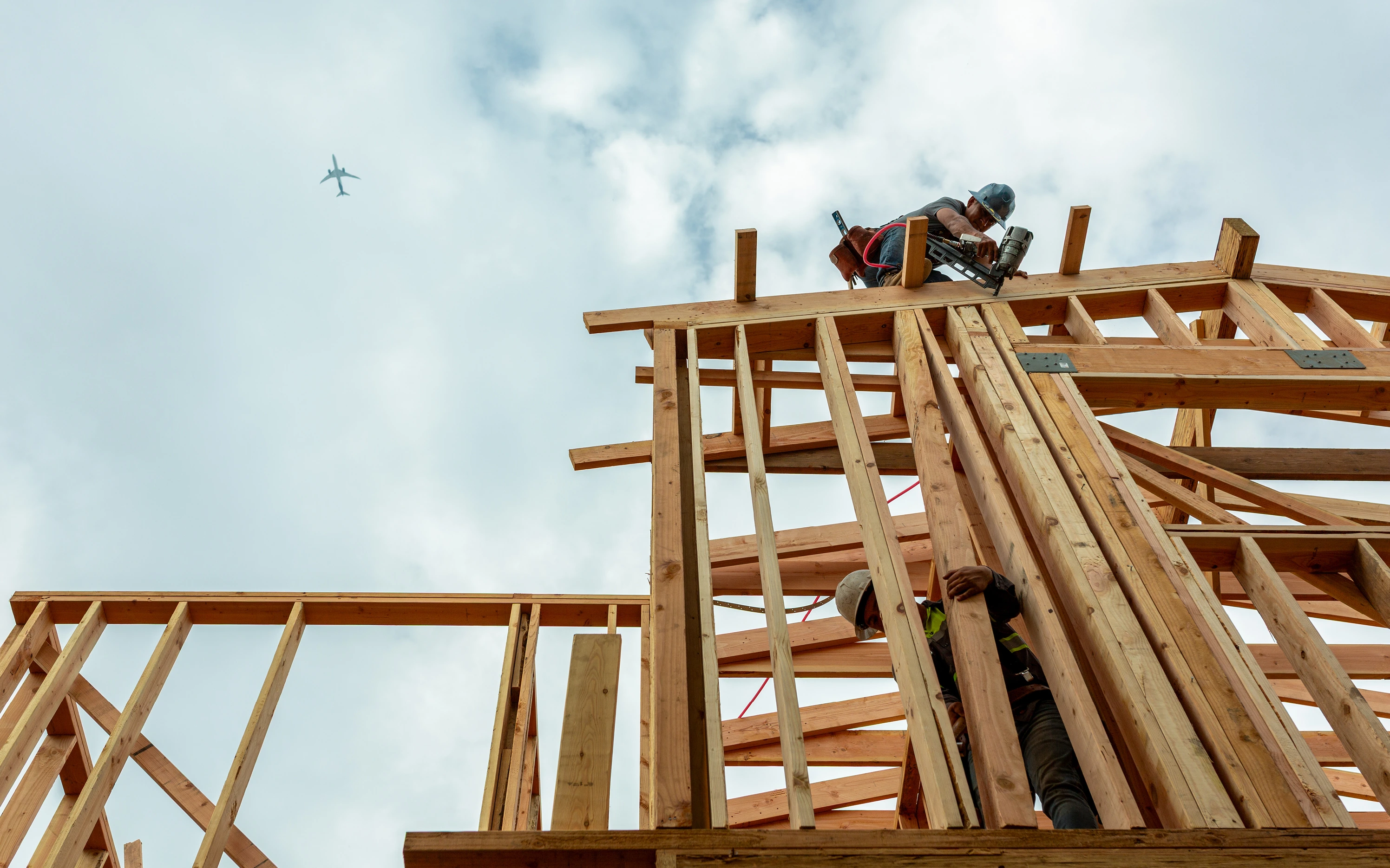
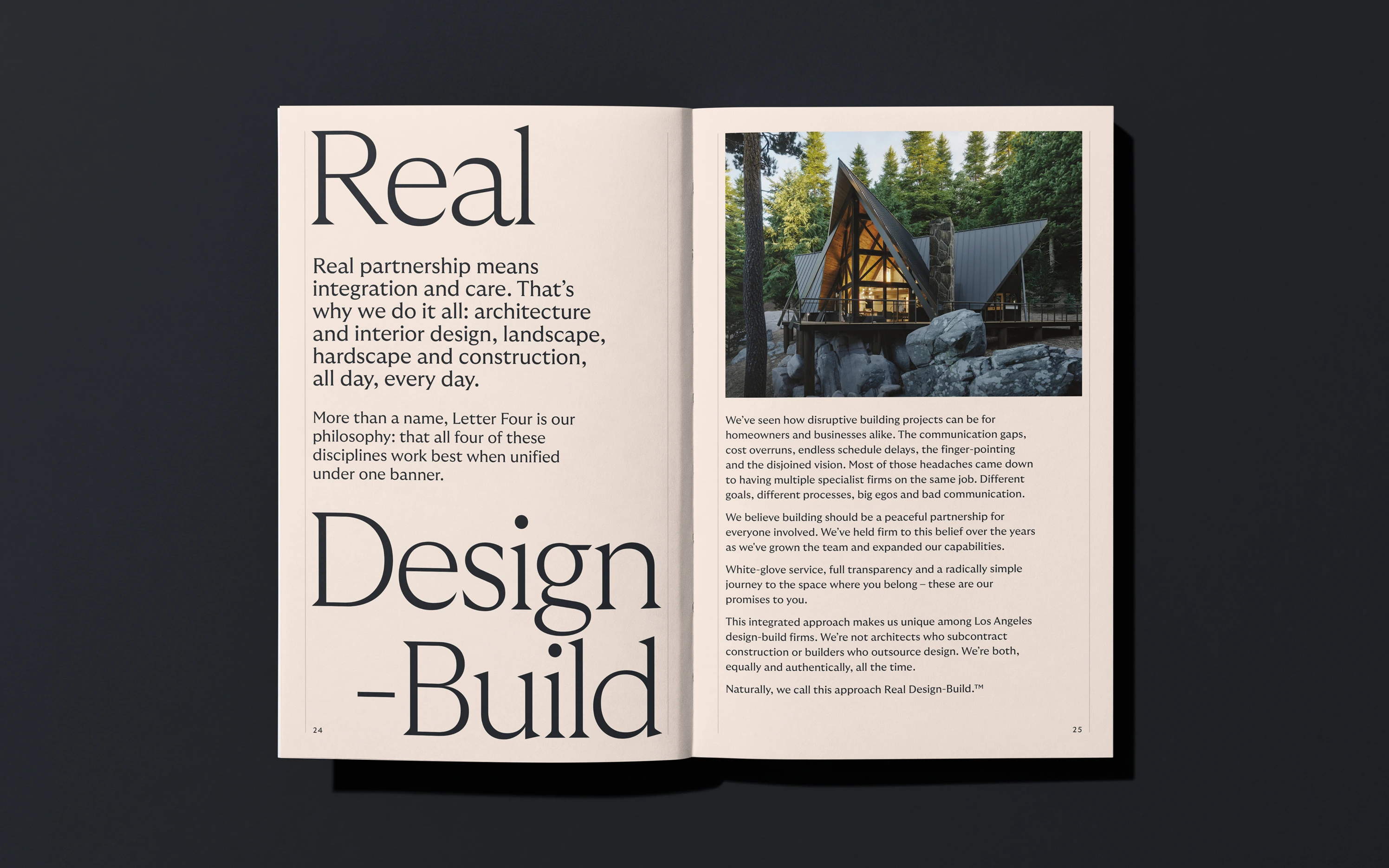
Real Design-Build
During discovery, I heard again and again about the firm’s honesty and transparent pricing. Simplicity from one team with four disciplines. Harmony from equally valuing design and construction and keeping them in constant communication.
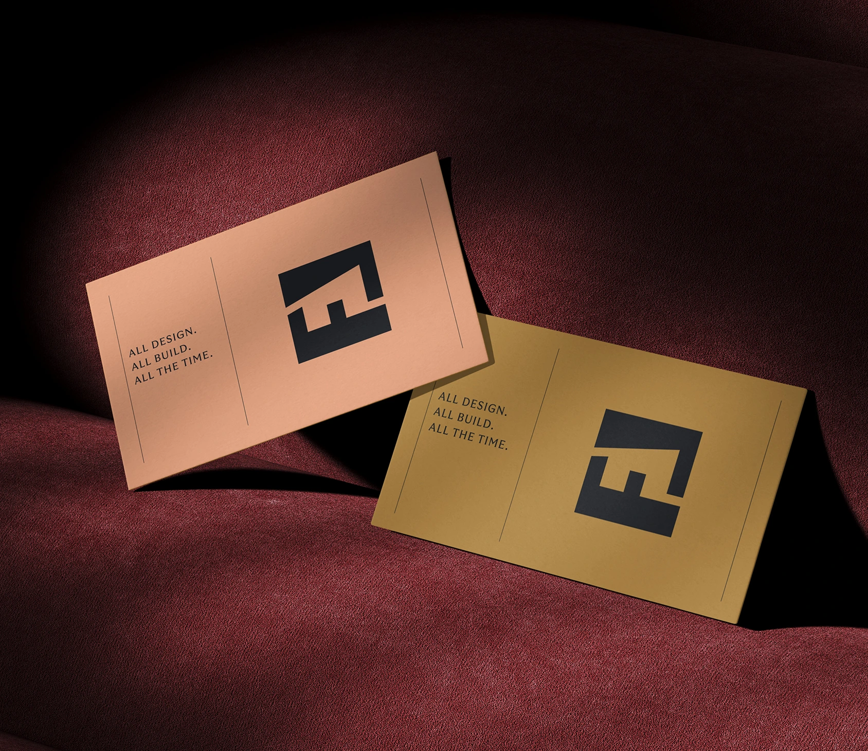
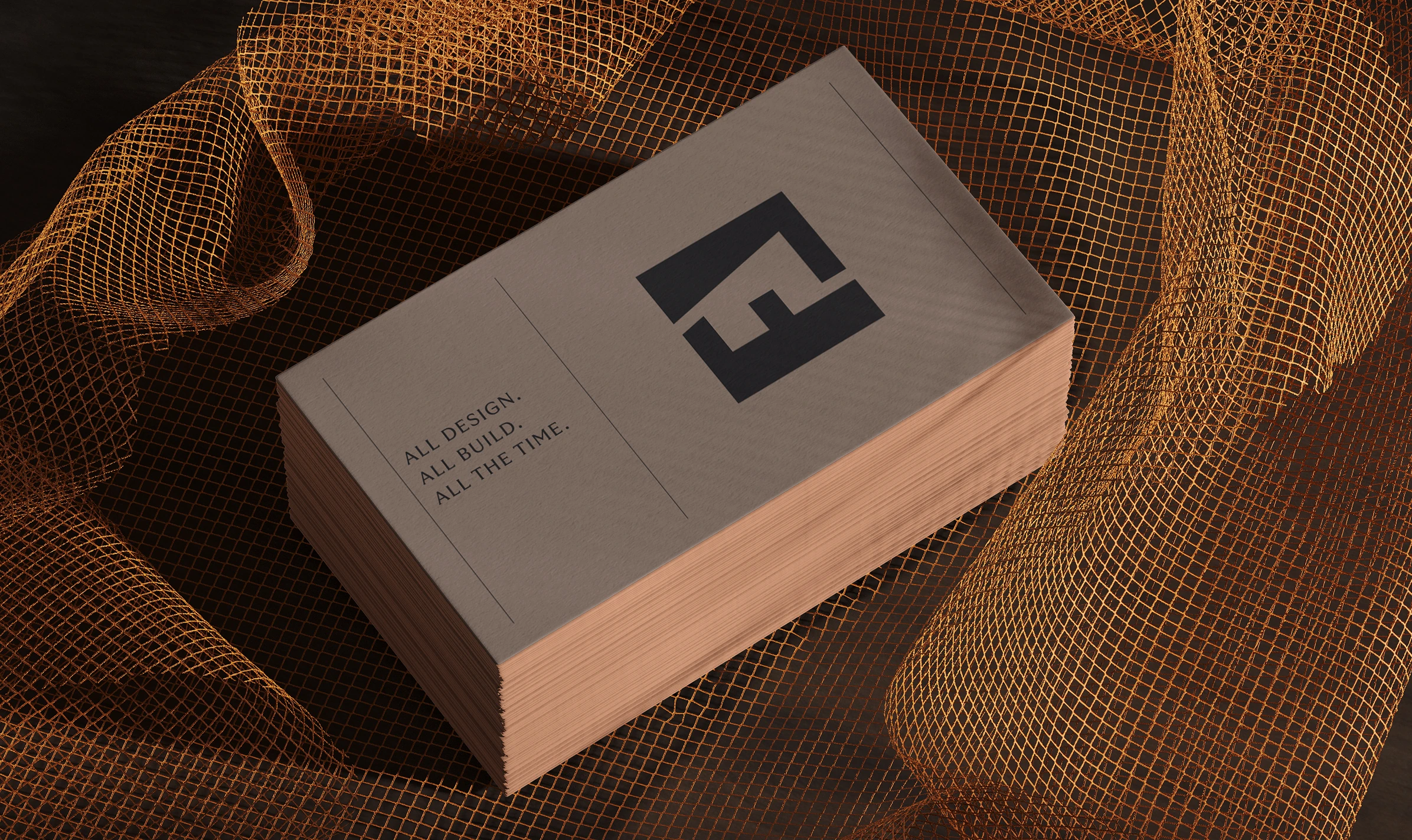
Here’s how I summed it up in their sales script: “A lot of companies say they do design-build, but few have design and construction represented at the partnership level, and even fewer offer architecture, interior design and construction under one roof. That’s why our tagline is All Design. All Build. All the Time.”
Sometimes repositioning means doubling down on the one thing you actually deliver while everyone else just promises it.
Articulating your core idea, purpose, mission, vision, values – that’s easy work, in the way that making a diamond with your bare hands is easy. But hard-won ideas don't land on their own. They need a voice built on real people, not flat archetypes.
Big companies rebrand and then hire the writers to keep their voice on point. A regional design-build firm doesn’t get that luxury, but that shouldn’t mean settling for copy that reeks of ChatGPT. So I built them a Brand Voice Blueprint – Enneagram-based guidelines precise enough that AI could execute them without sounding like AI. It was a first-time experiment for me that paid off: a busy partner’s five-hour blogging job dropped to thirty minutes.
A position is only as strong as the thousandth sentence written in its name.
Brand Strategy Highlights
Unbreakable Idea
All Design. All Build. All the Time.™
Purpose
Building should be a peaceful partnership for everyone involved.
Mission
We’re here to guide you on a radically simple journey to the space where you belong.
Vision
The end of painful construction projects.
Values
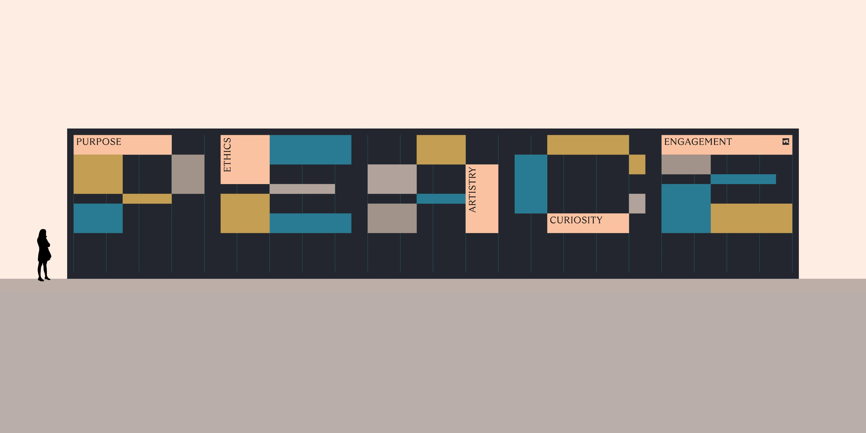
PEACE: Purpose · Ethics · Artistry · Curiosity · Engagement
Promises
White-glove service · Real Design-Build™ · Full transparency · A place to belong
Spirit
We are visionaries leading visionaries.
Manifesto (excerpt)
Where we live is inseparable from how we live, and the defining quality of a good building is that it feels like a natural extension of the people who use it.
Of course, your house should be a home. That’s given. So why can’t our offices and stores and hotels feel just as inviting? If they’re made by and for humans, why is it okay for buildings to be dull and uncomfortable?
The buildings in our lives should place us and anchor us. Because we don’t live on the internet or in the clouds. We live in structures on streets in neighborhoods. Our built environments should feel like a second skin, an extension of our identities, in communities we love.
Revolution, then Evolution
To help Letter Four double down on design-build and stand apart from competitors with similar claims, we overhauled and turbo-charged their brand strategy and messaging. Same offering, all-new words – a revolution.
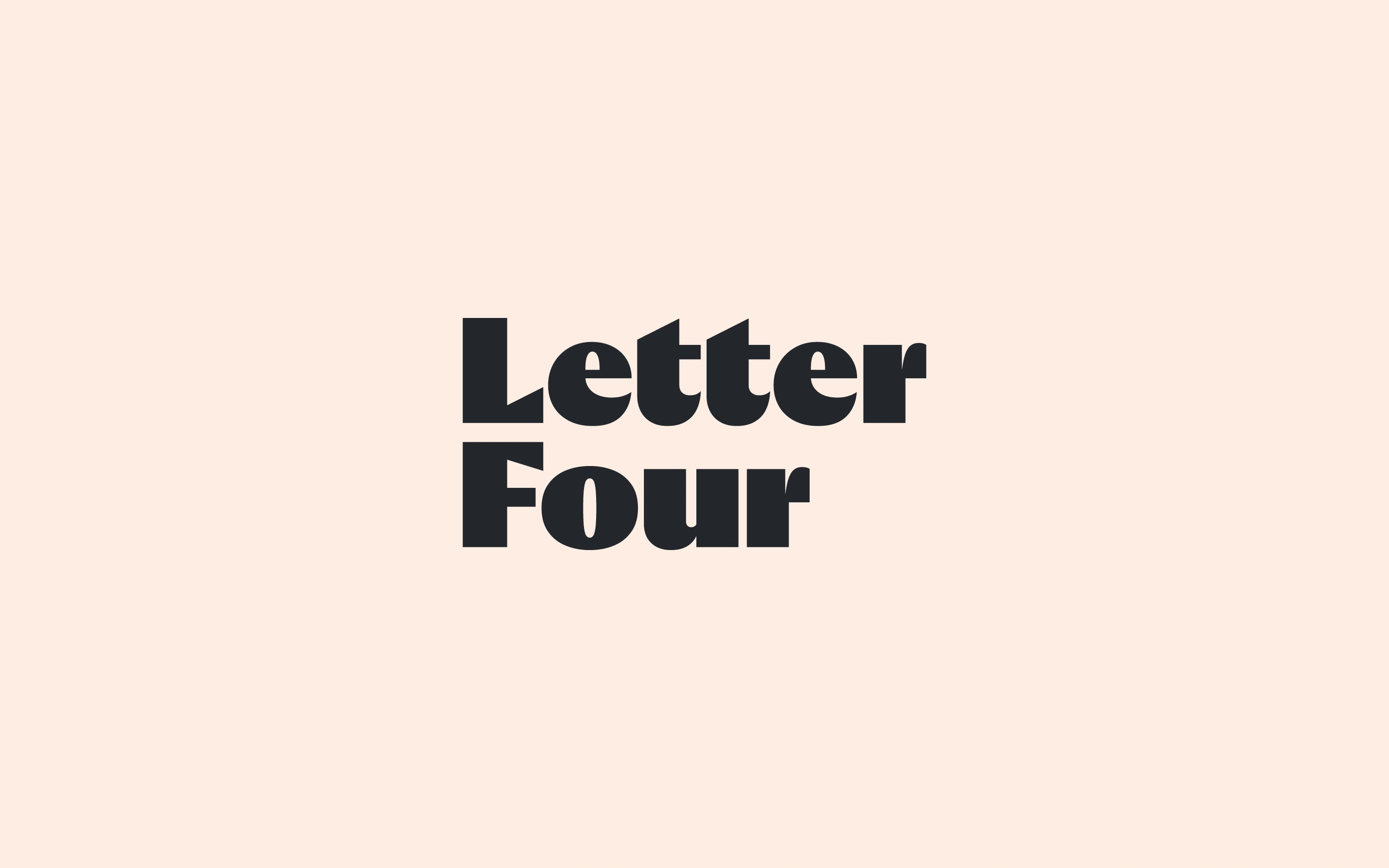
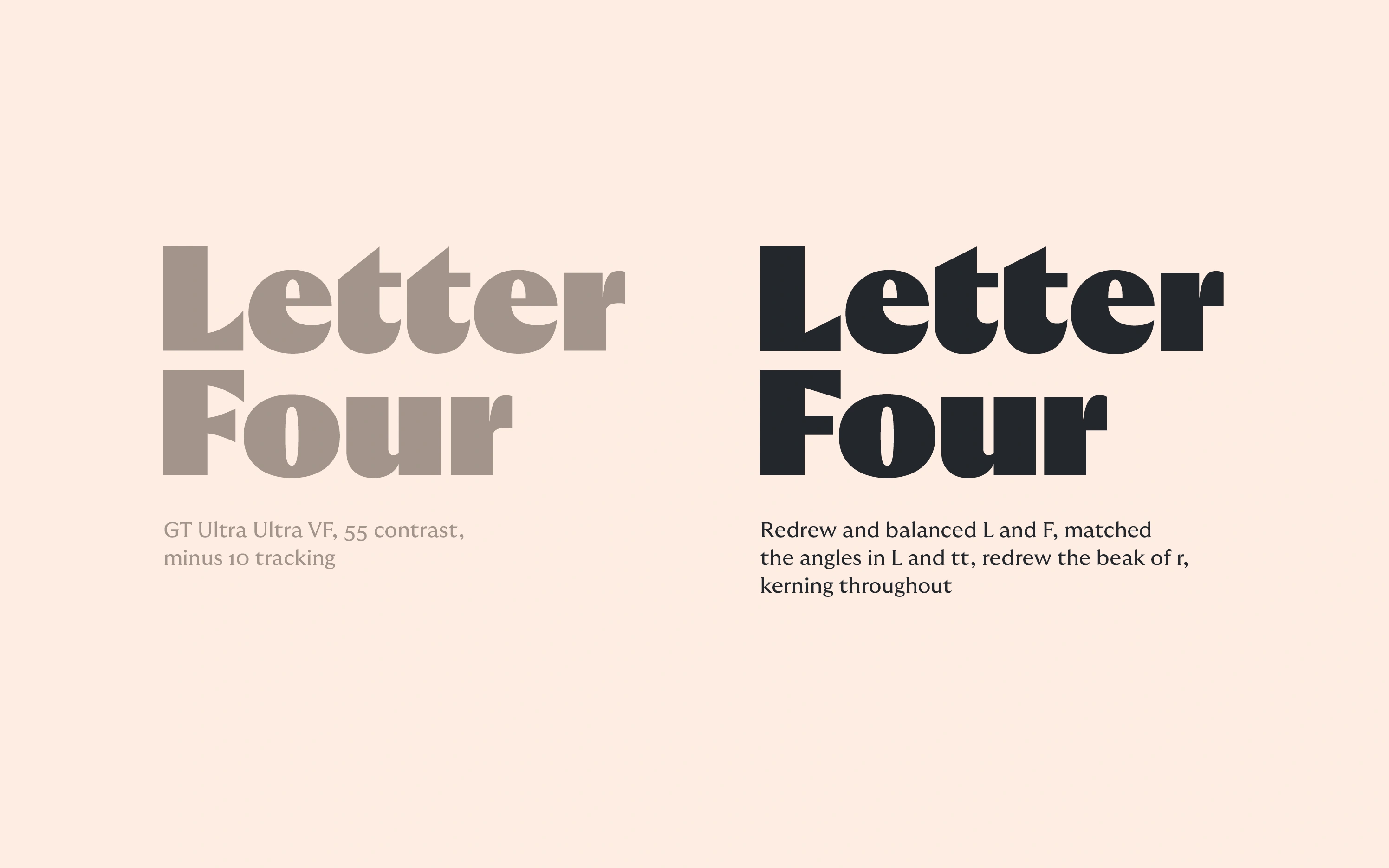
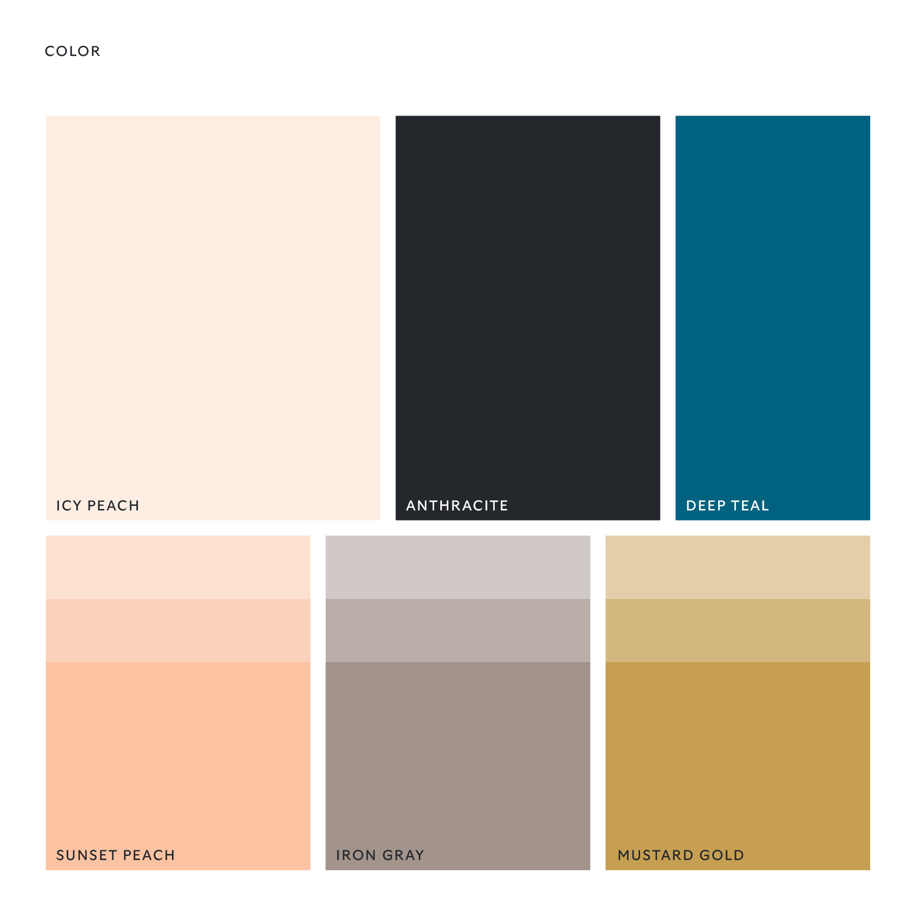
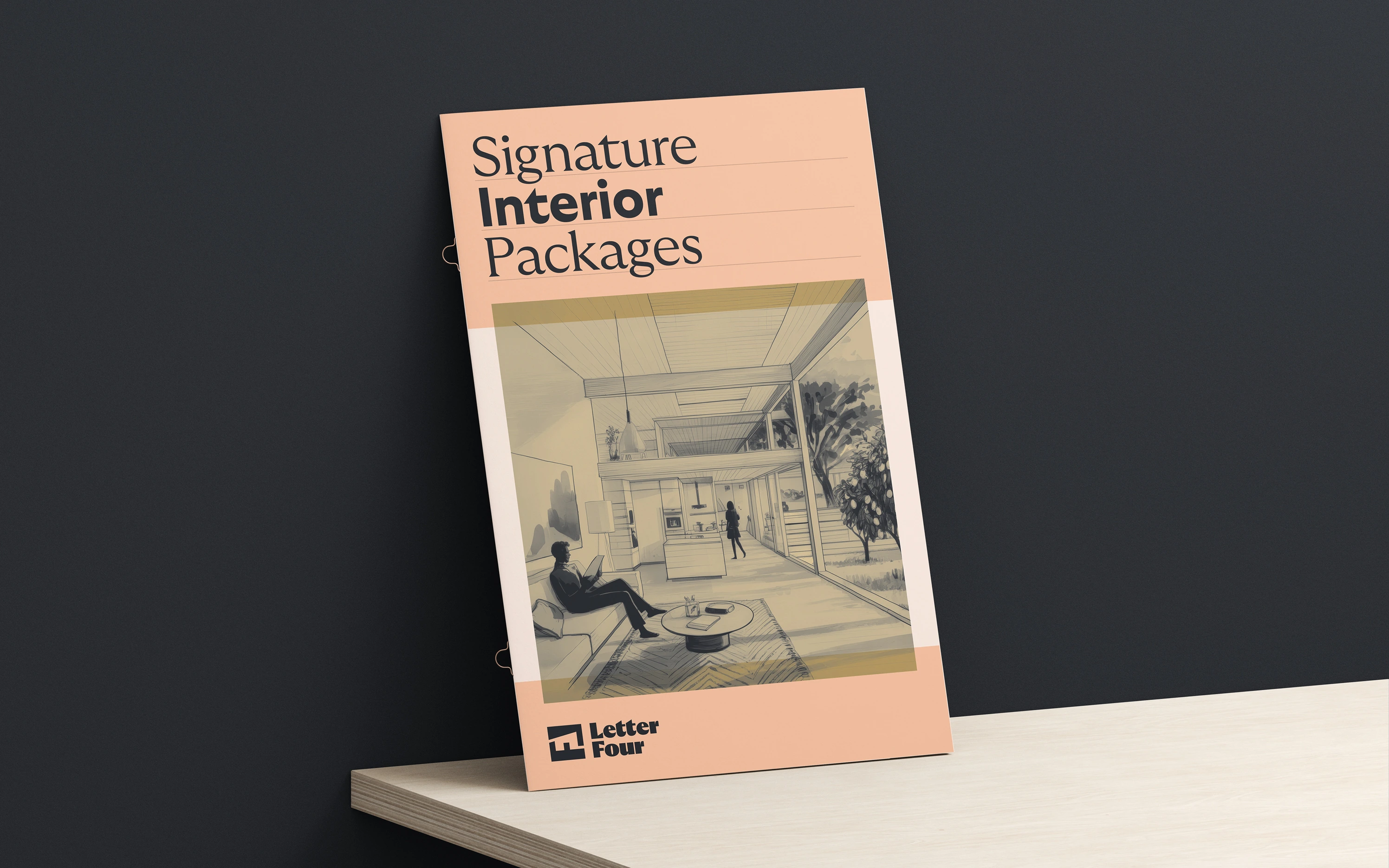
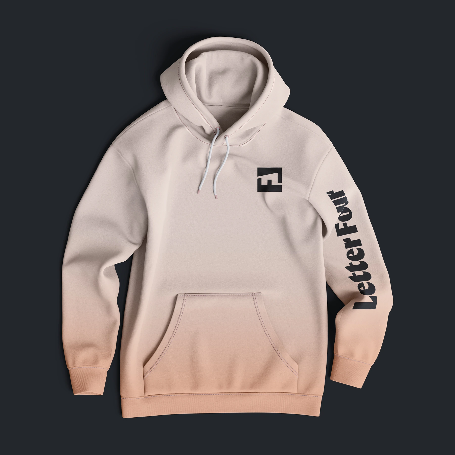
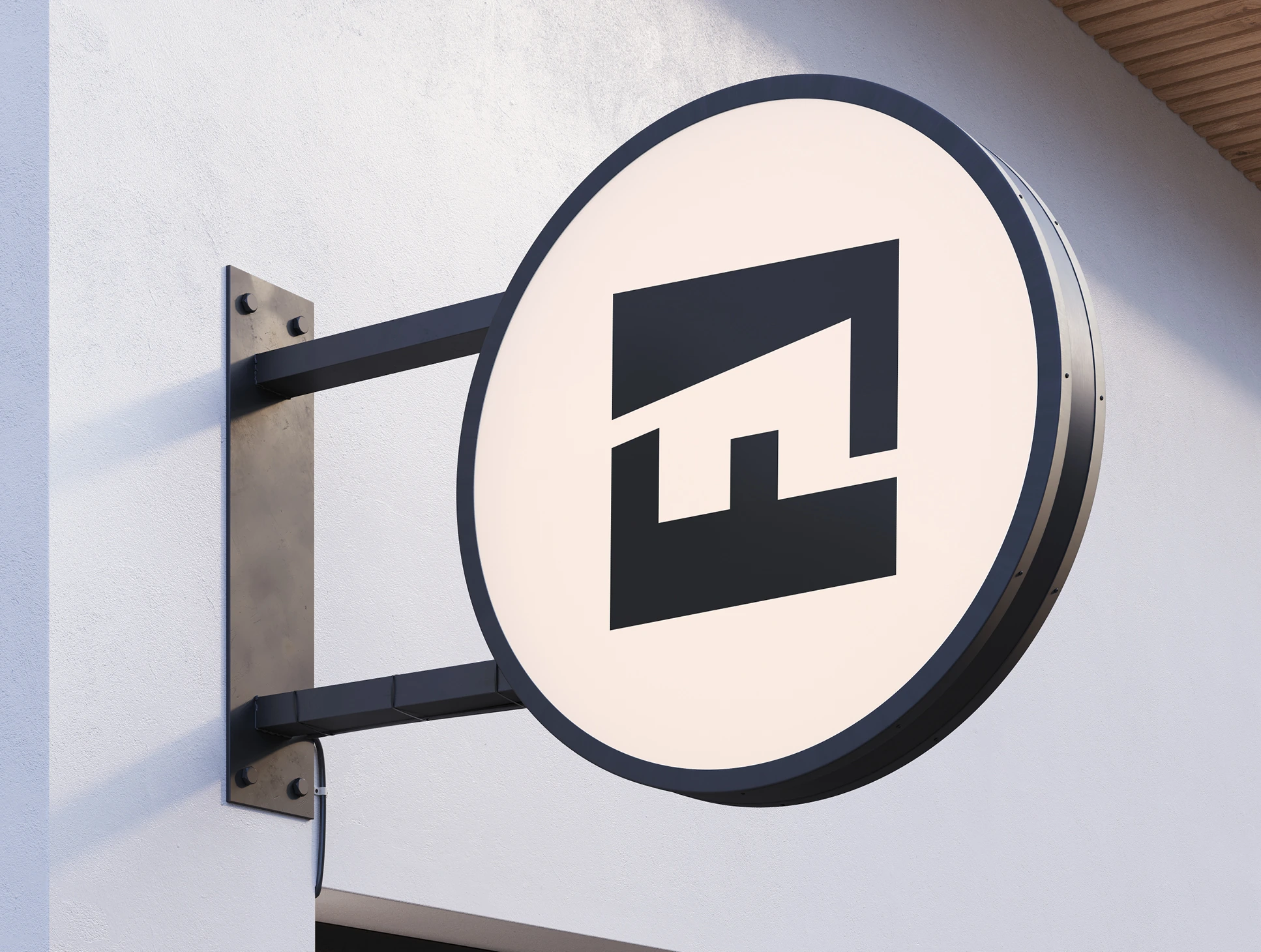
Visually, a comprehensive evolution was the right move. The firm’s previous visual identity wasn’t terrible. The concept behind their symbol was brilliant but poorly executed. Their distinctive peach color was a breath of fresh coastal air; it had to stay, full stop.
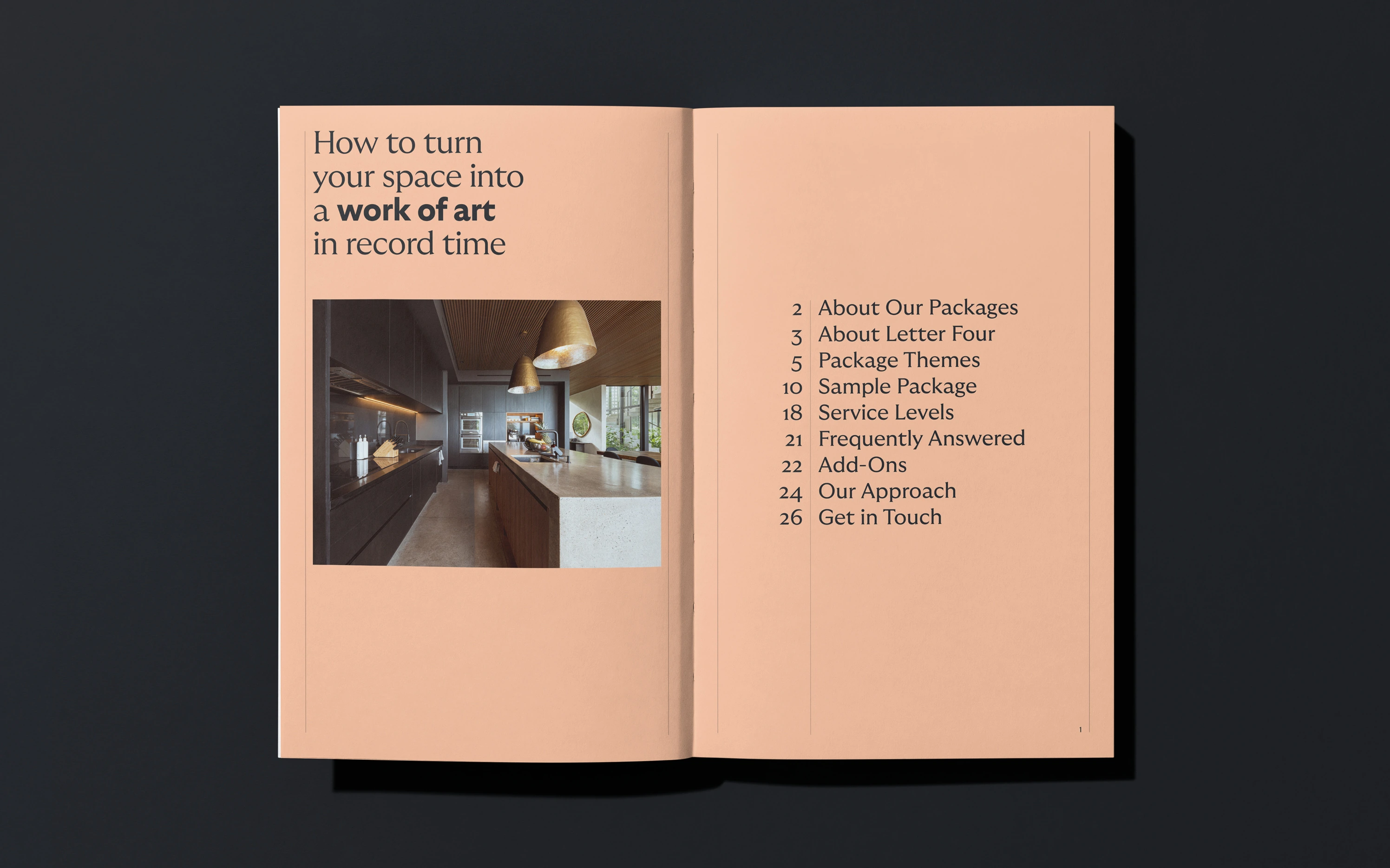
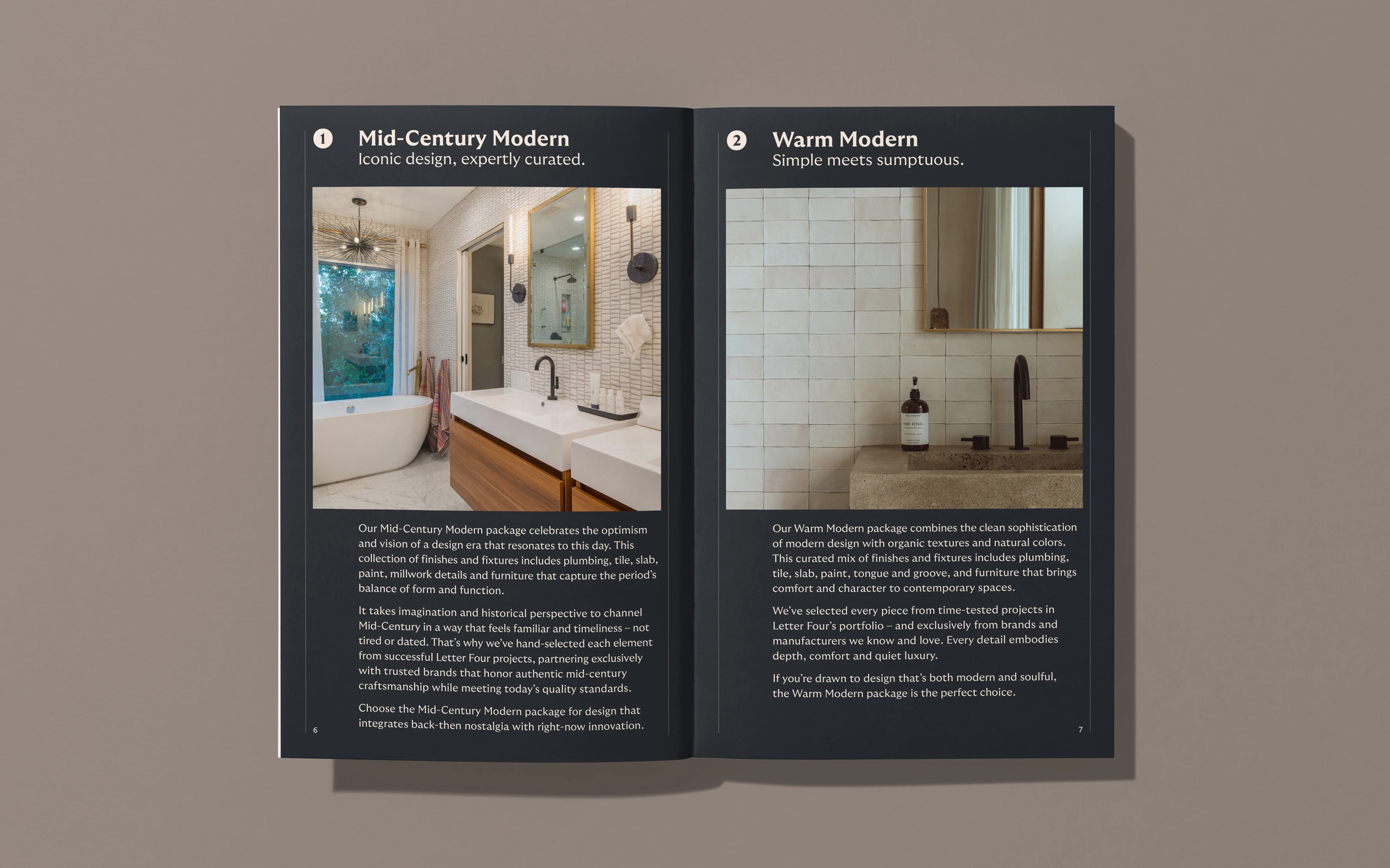
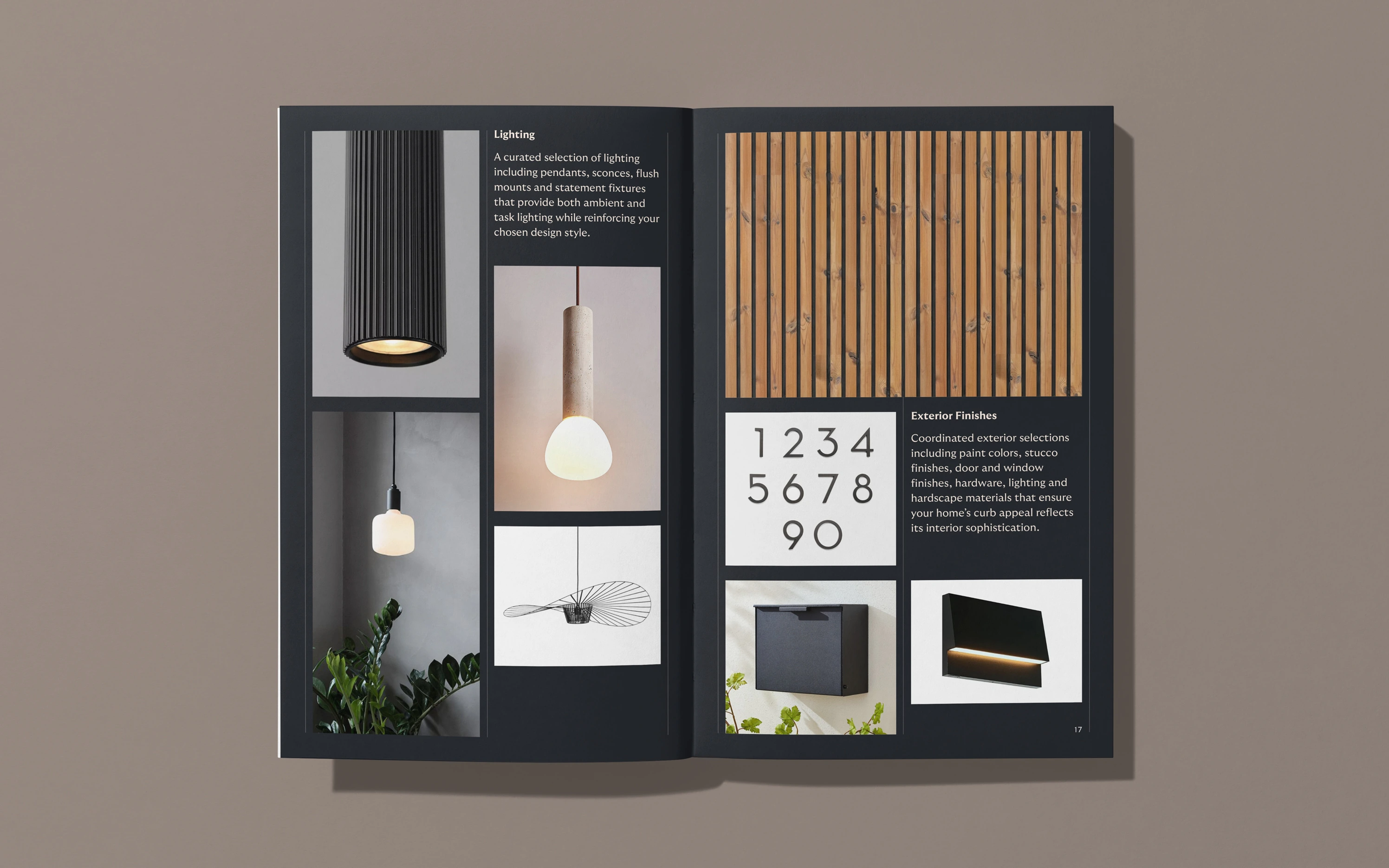
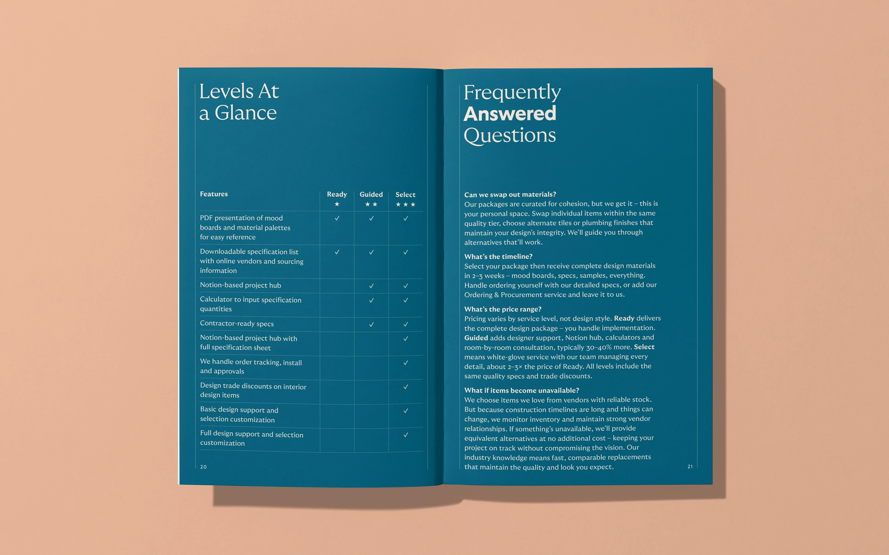
The comprehensive part? Everything else changed, from new colors to typography, graphic elements, photography and layout. And I went a layer deeper, helping Letter Four streamline and redesign their processes, templates and tools for marketing and business development.
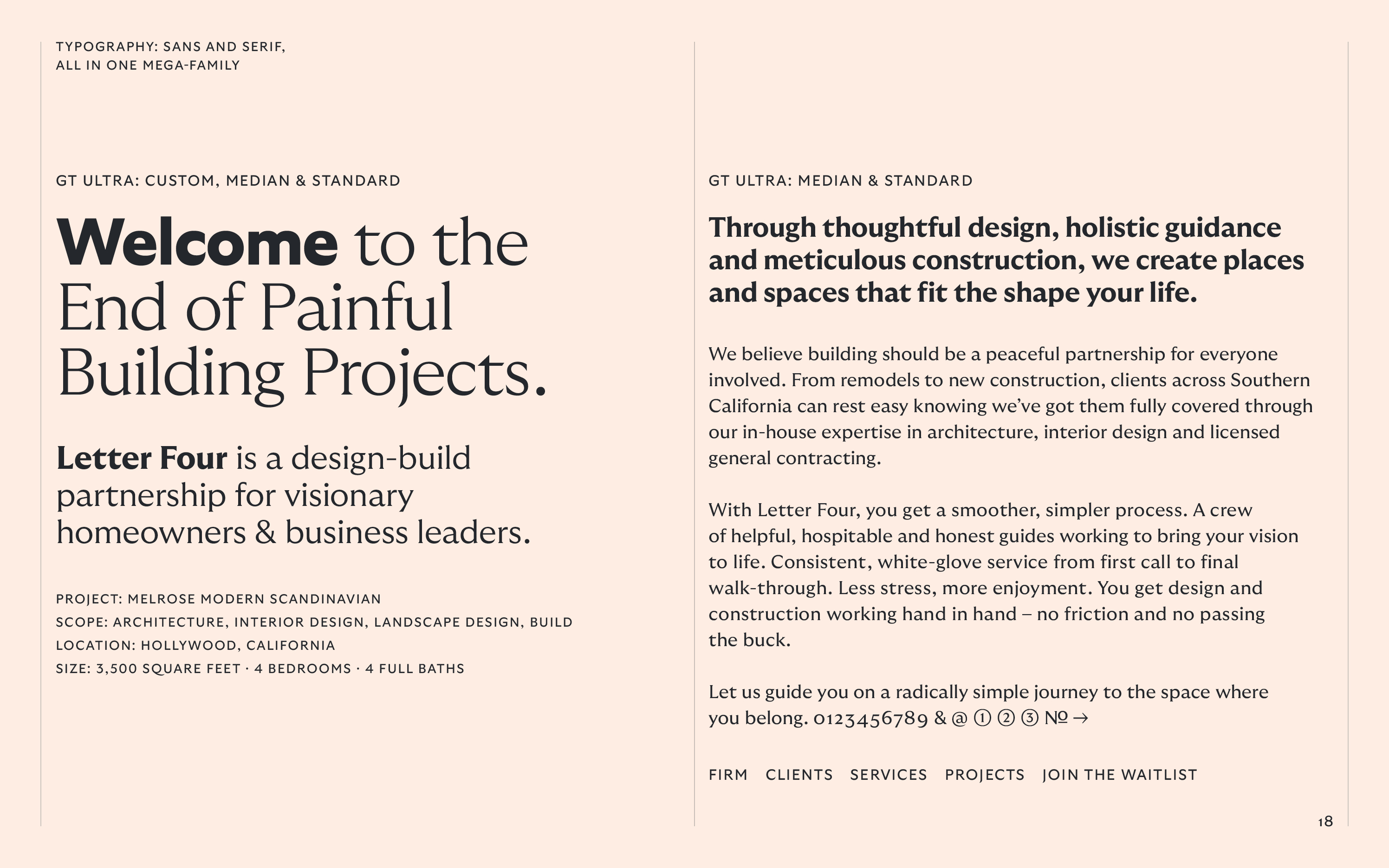

The Science of Good Vibes

Letter Four wanted to bring graphic design in-house after the rebrand. To streamline layout decisions and ensure coherence across media, I devised a modular 12 x 12 grid and a standardized set of proportions for layouts and image framing on-screen and in print.
All seven proportions are based on musical intervals in the chromatic scale – from unison (1:1) and major second (8:9) to major seventh (8:15) – avoiding “minor chord” proportions where possible. This rule reinforces Letter Four’s brand attribute of warmth, subliminally giving the viewer a sense of calm optimism.

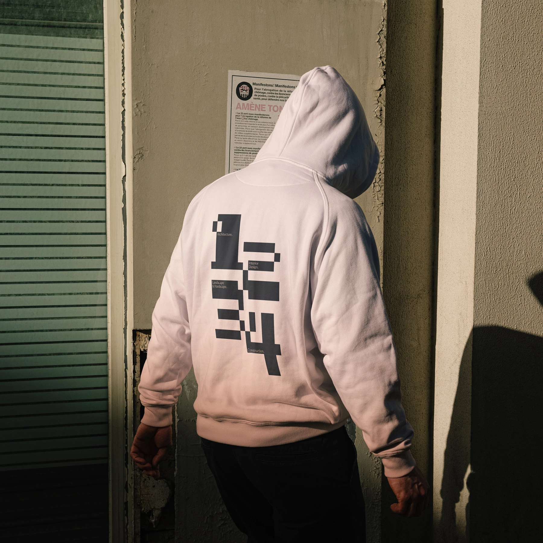
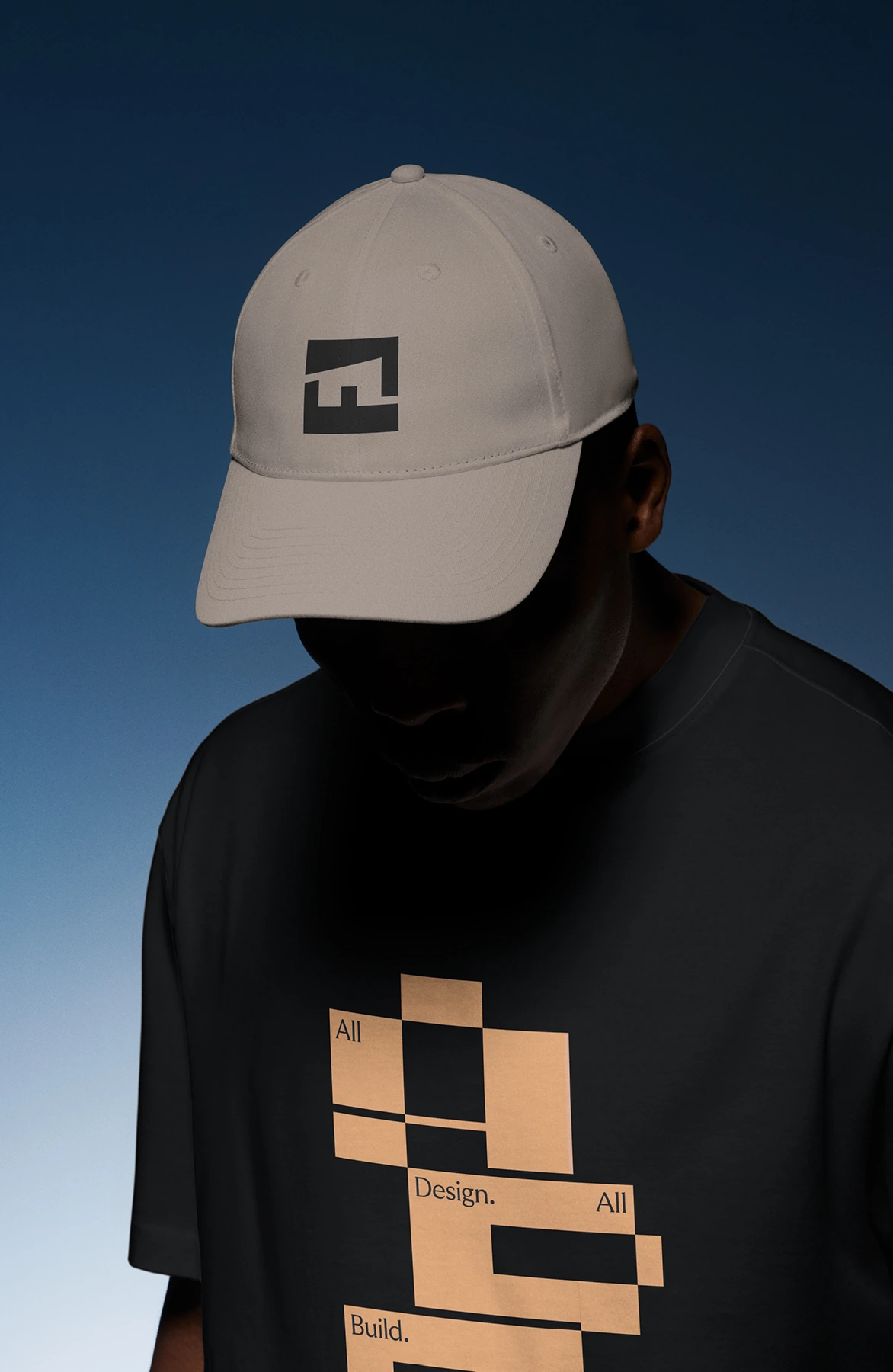
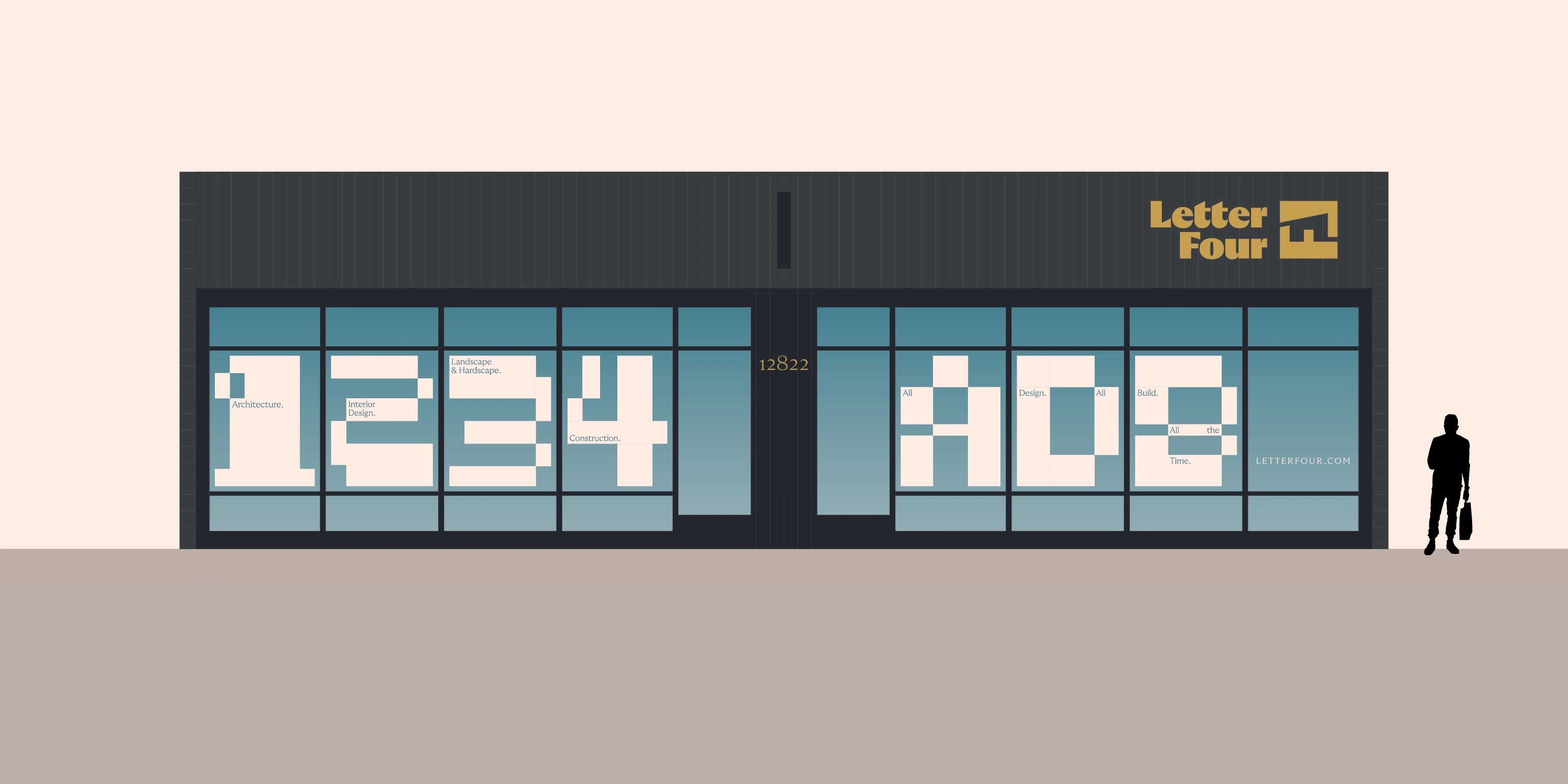
Beyond layouts, I used the grid for stylized letters and numbers that stretch and squeeze, adapting to the screen or page’s proportions. The blocky compositions resemble floor plans and pixels, both of which rely on rectangles to frame spaces.

Keeping It Actually Real
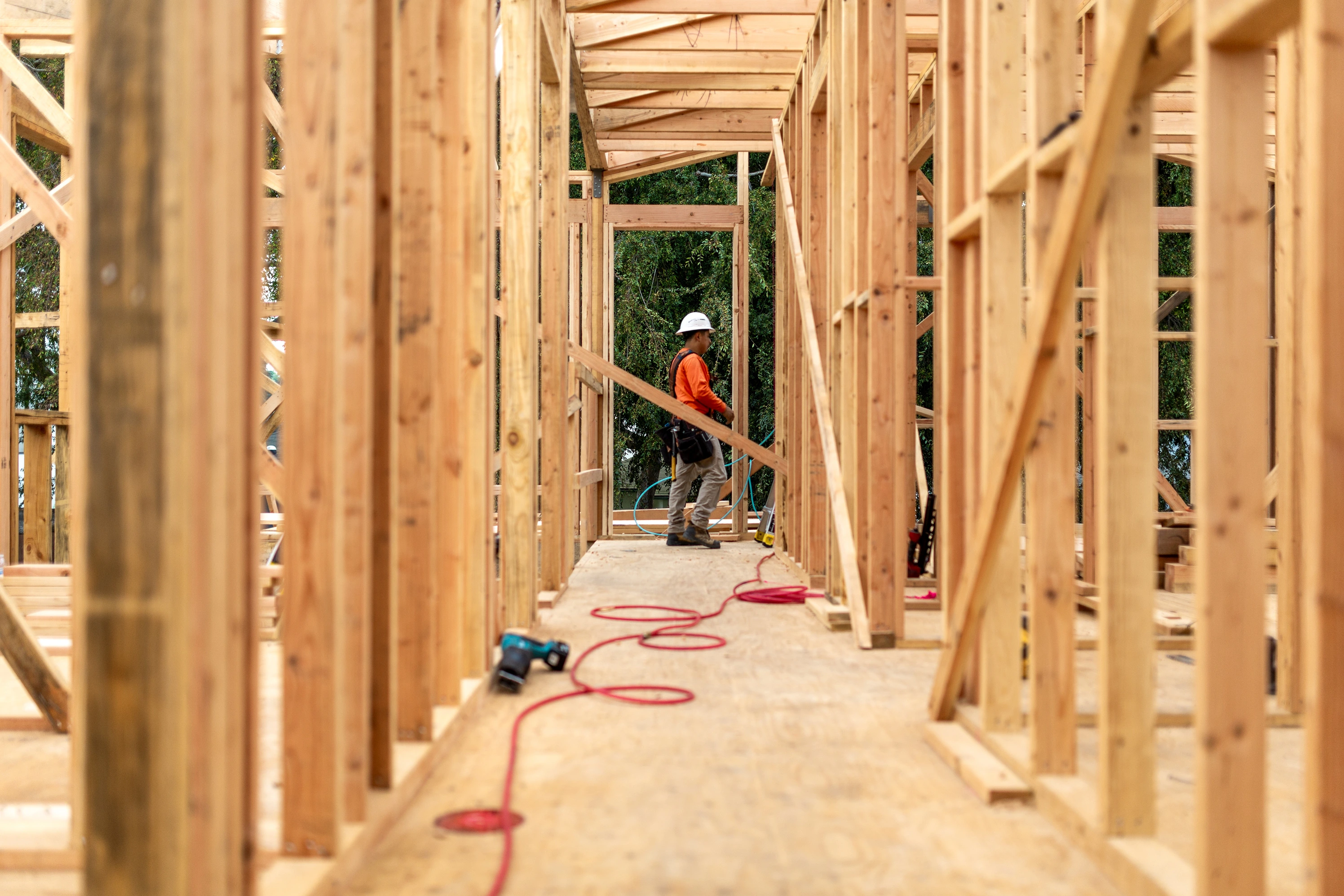
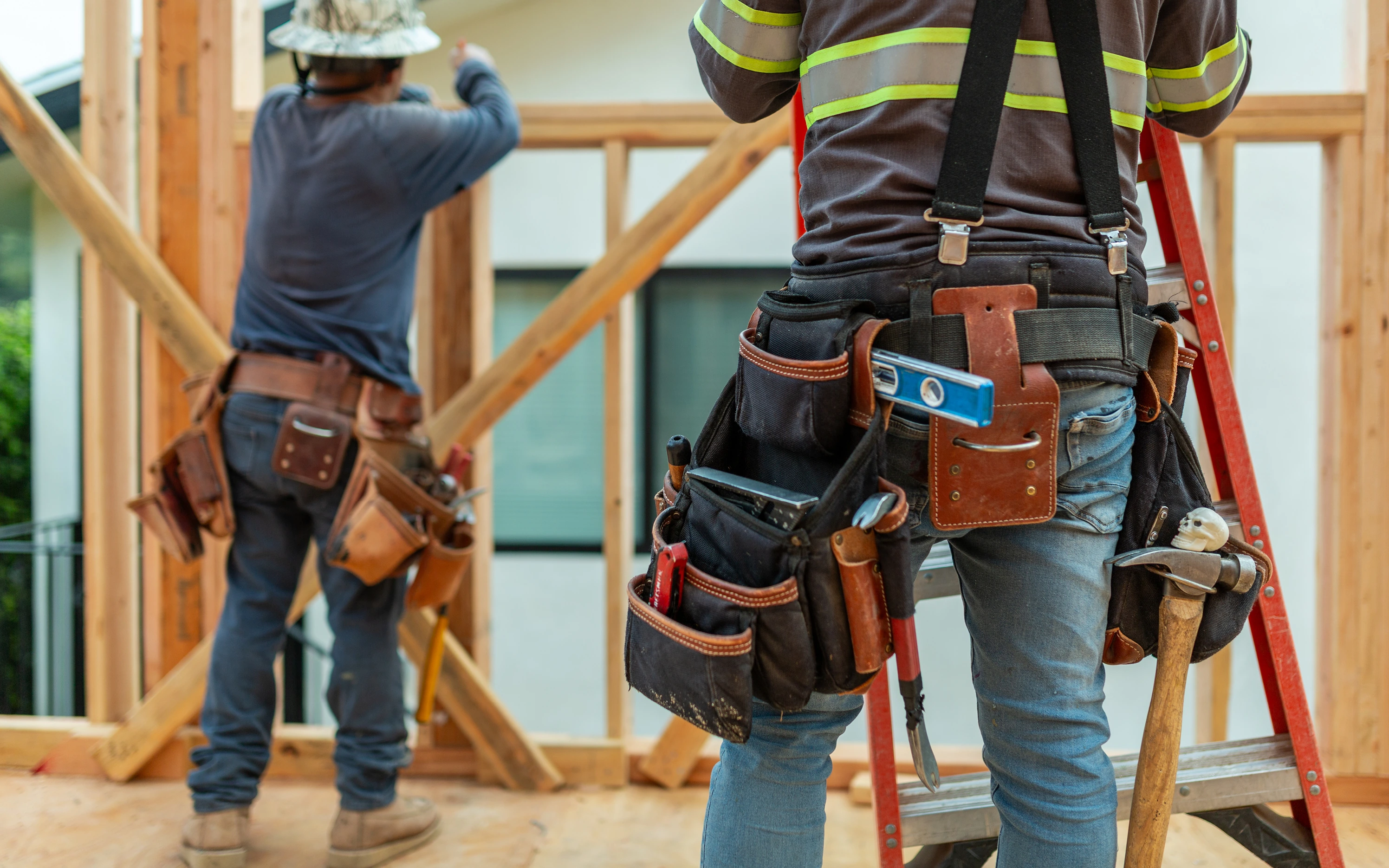
Since day one, Letter Four has been equal parts design and build. But a glance at their website and social media only showed finished projects. Manicured landscaping, immaculate interiors. None of the wet concrete, buzzing saws and steel-toed boots. None of the build.
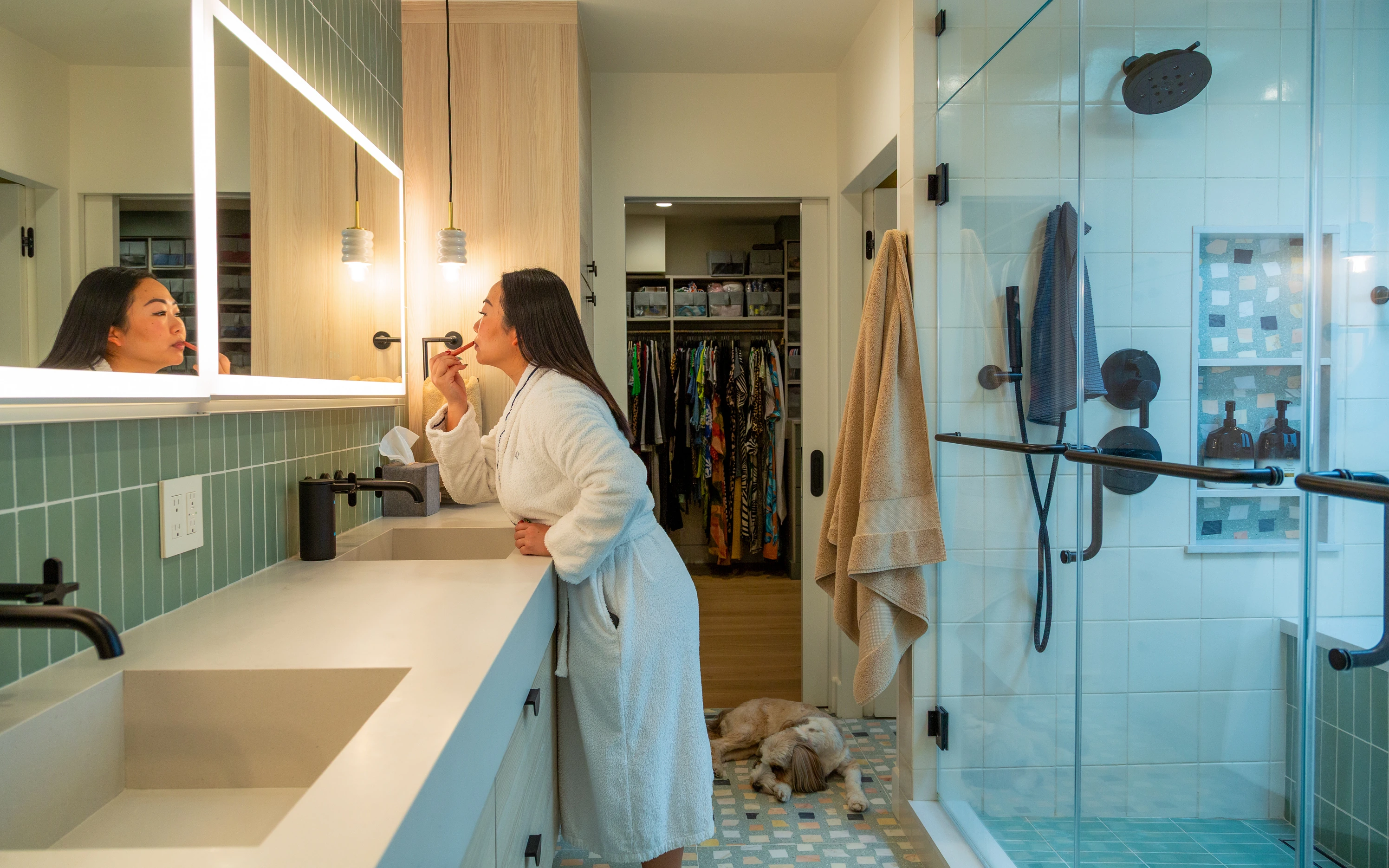
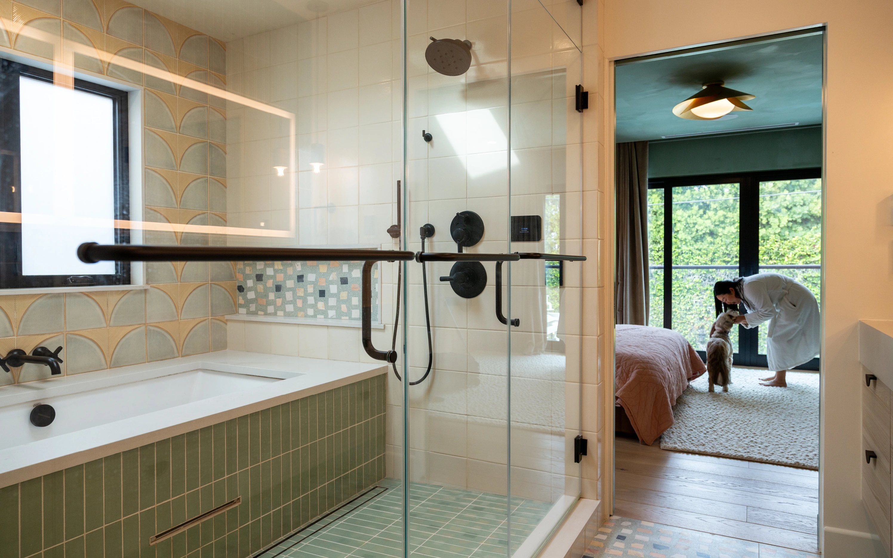
It's an industry-wide pattern. Design-build portfolios show finished spaces, empty of people and pets. It makes sense – your eye catches architectural details without distractions. But empty rooms don't tell stories. And across the field, we saw a gap no one was filling: real people in the built environments where they actually live and work.
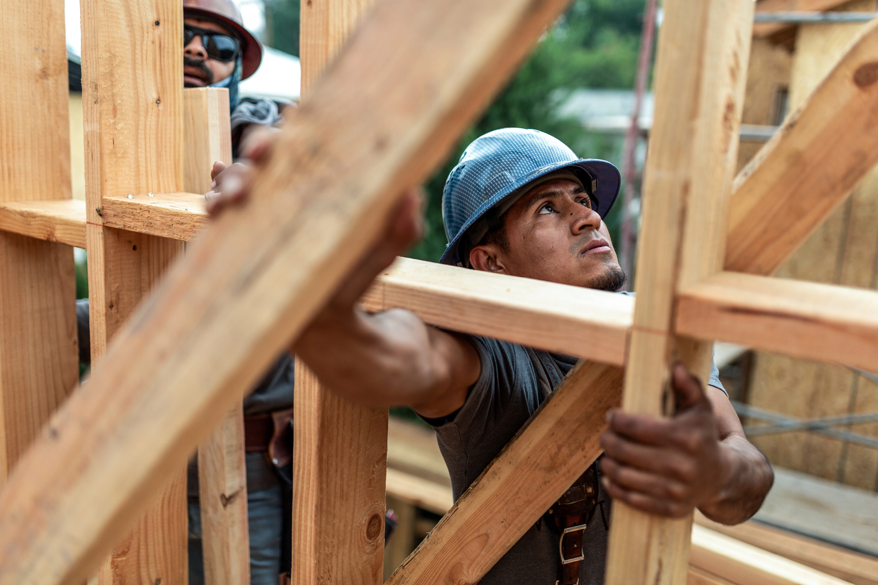
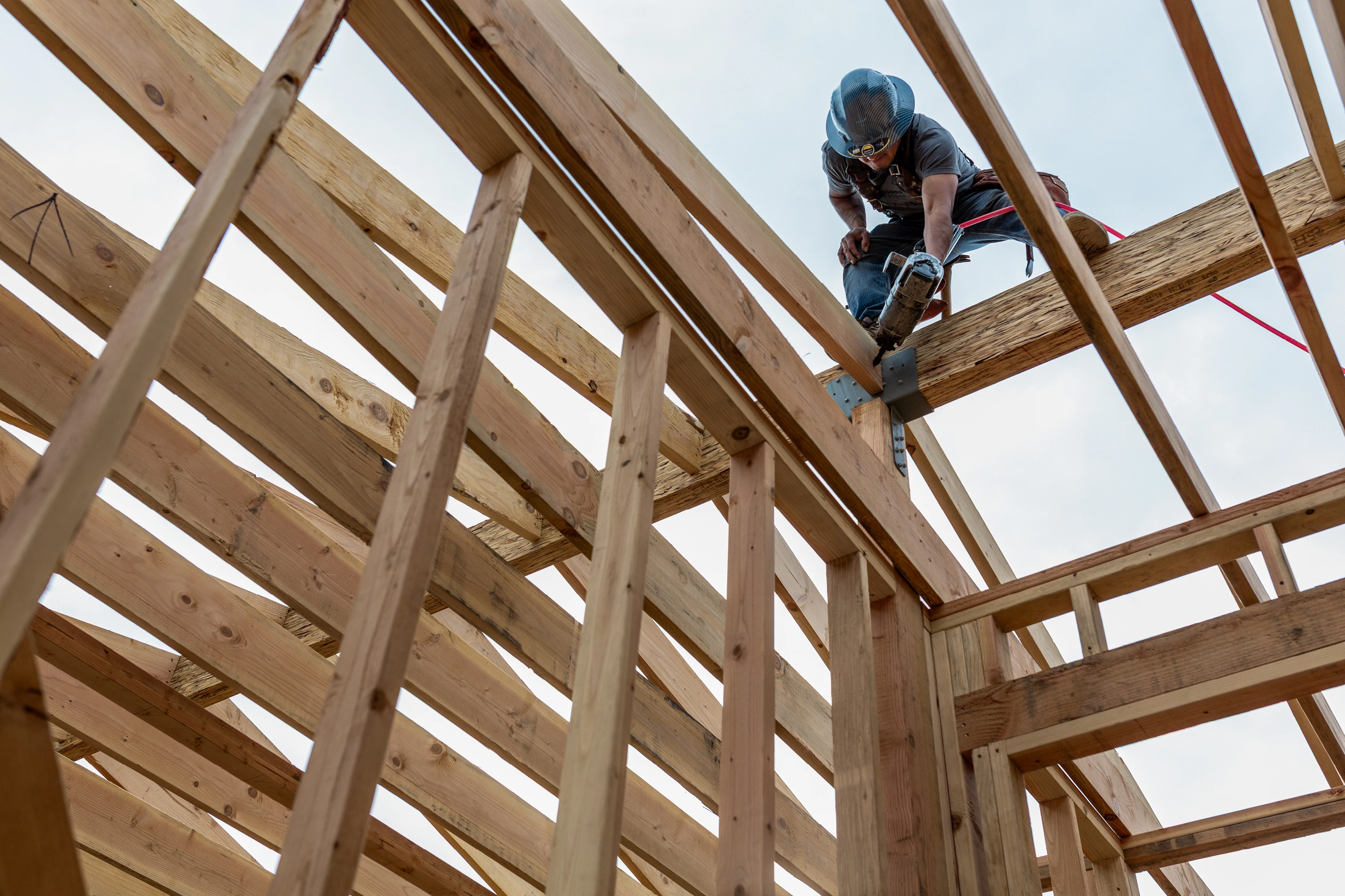
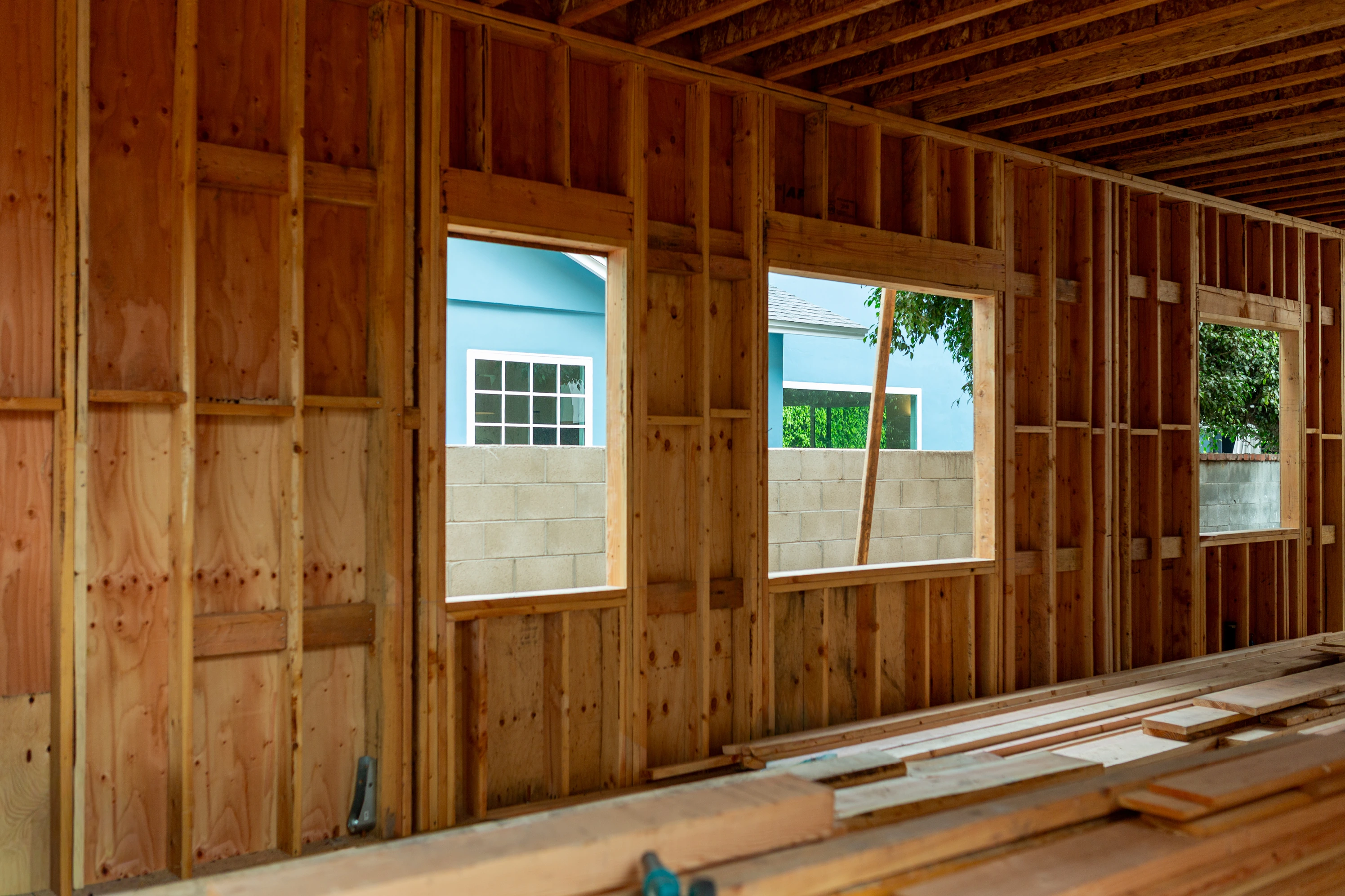
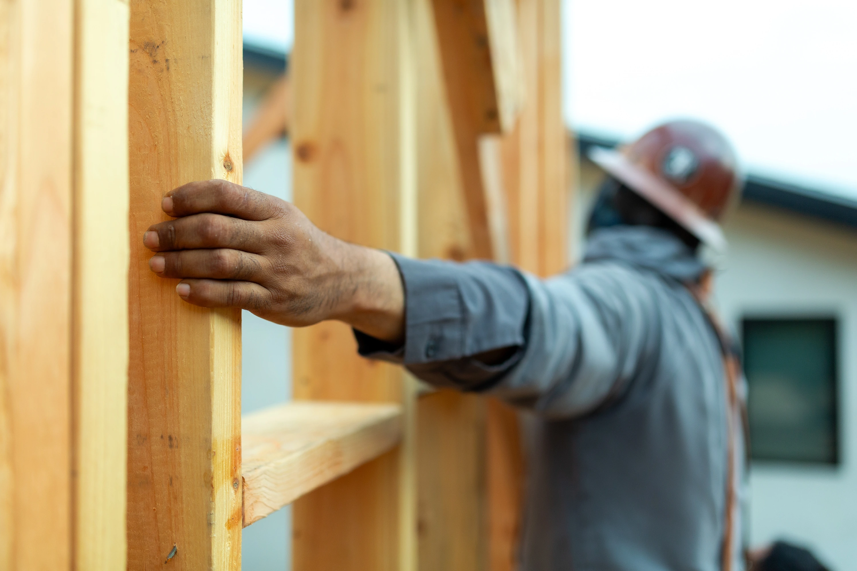
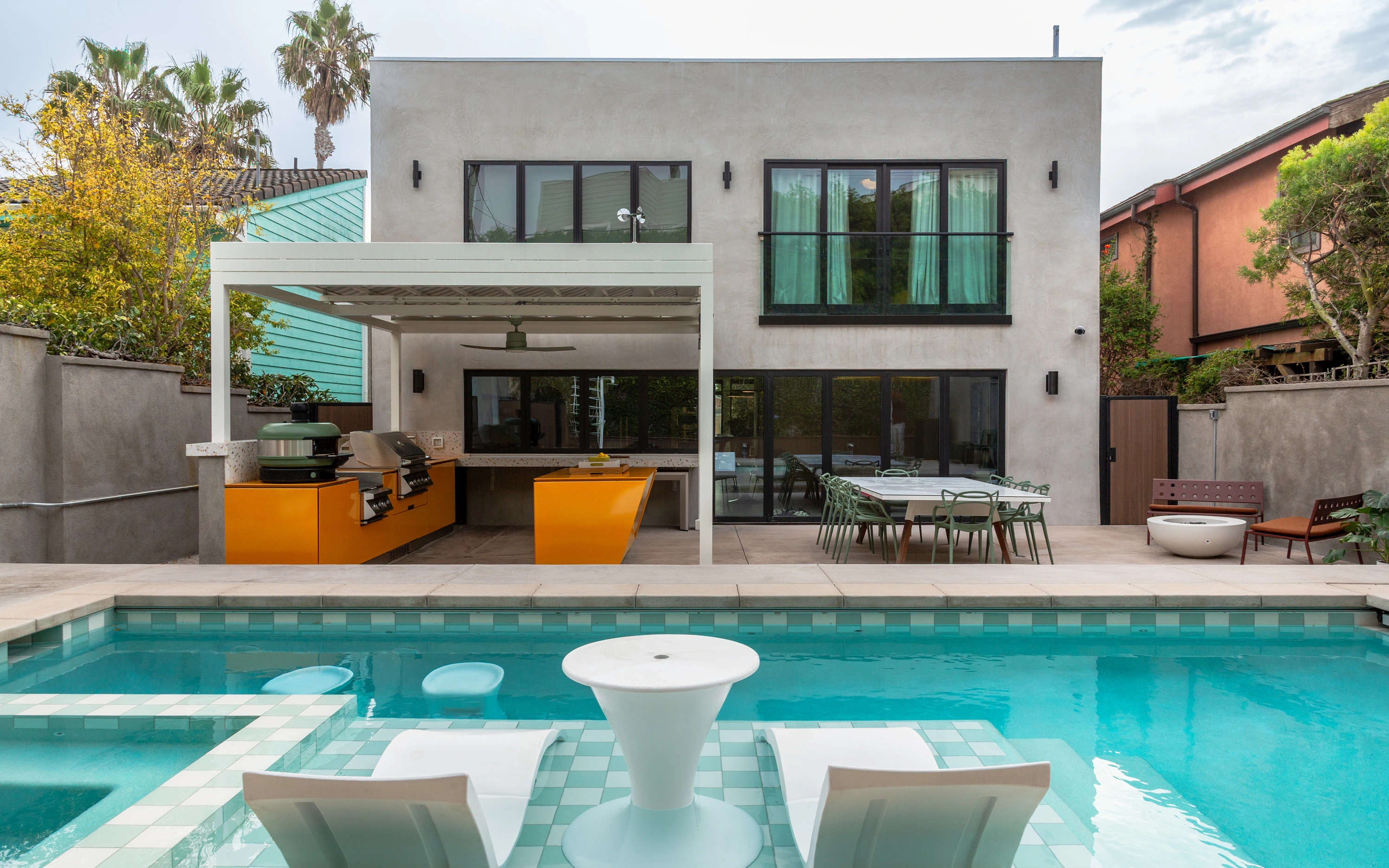
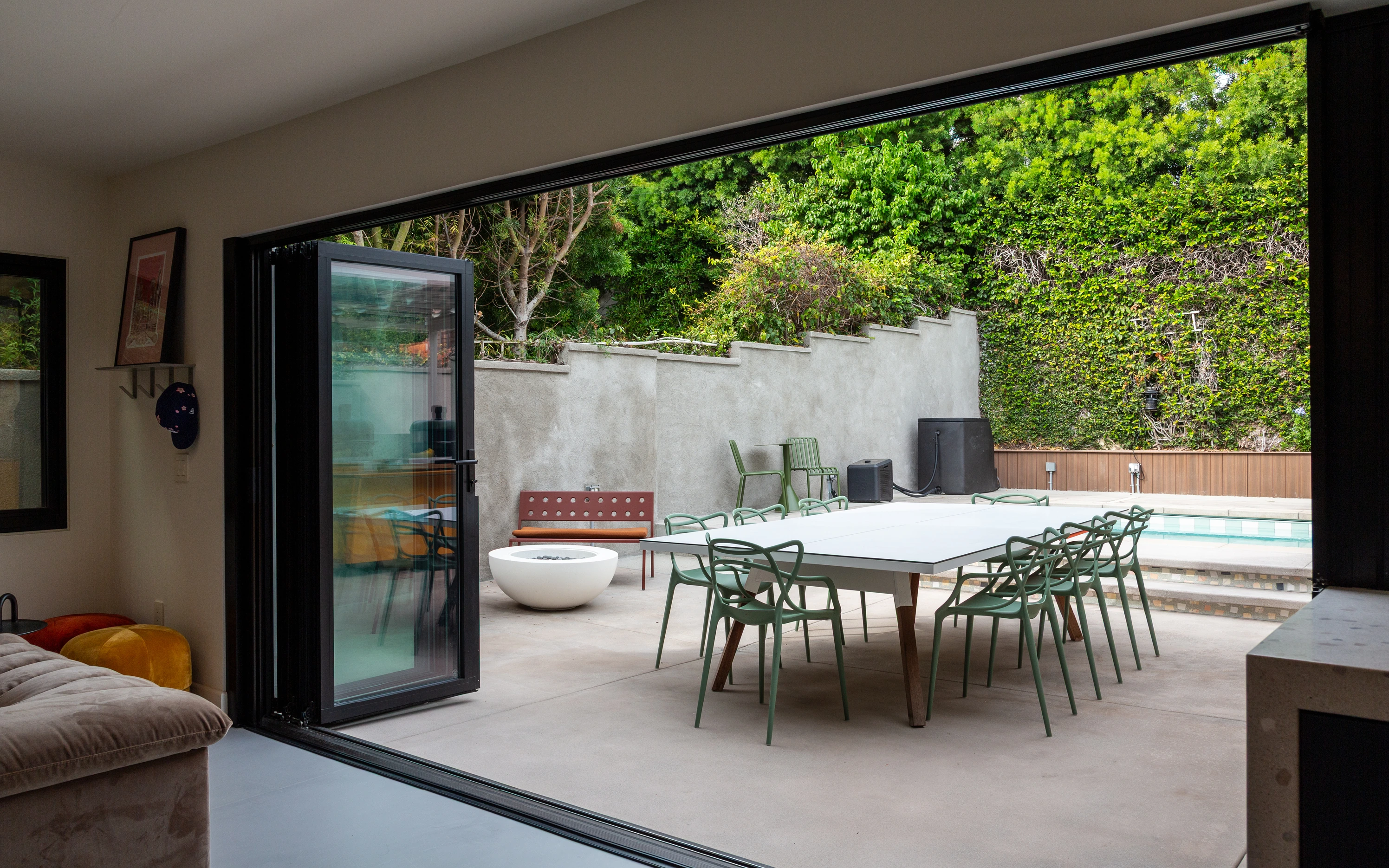
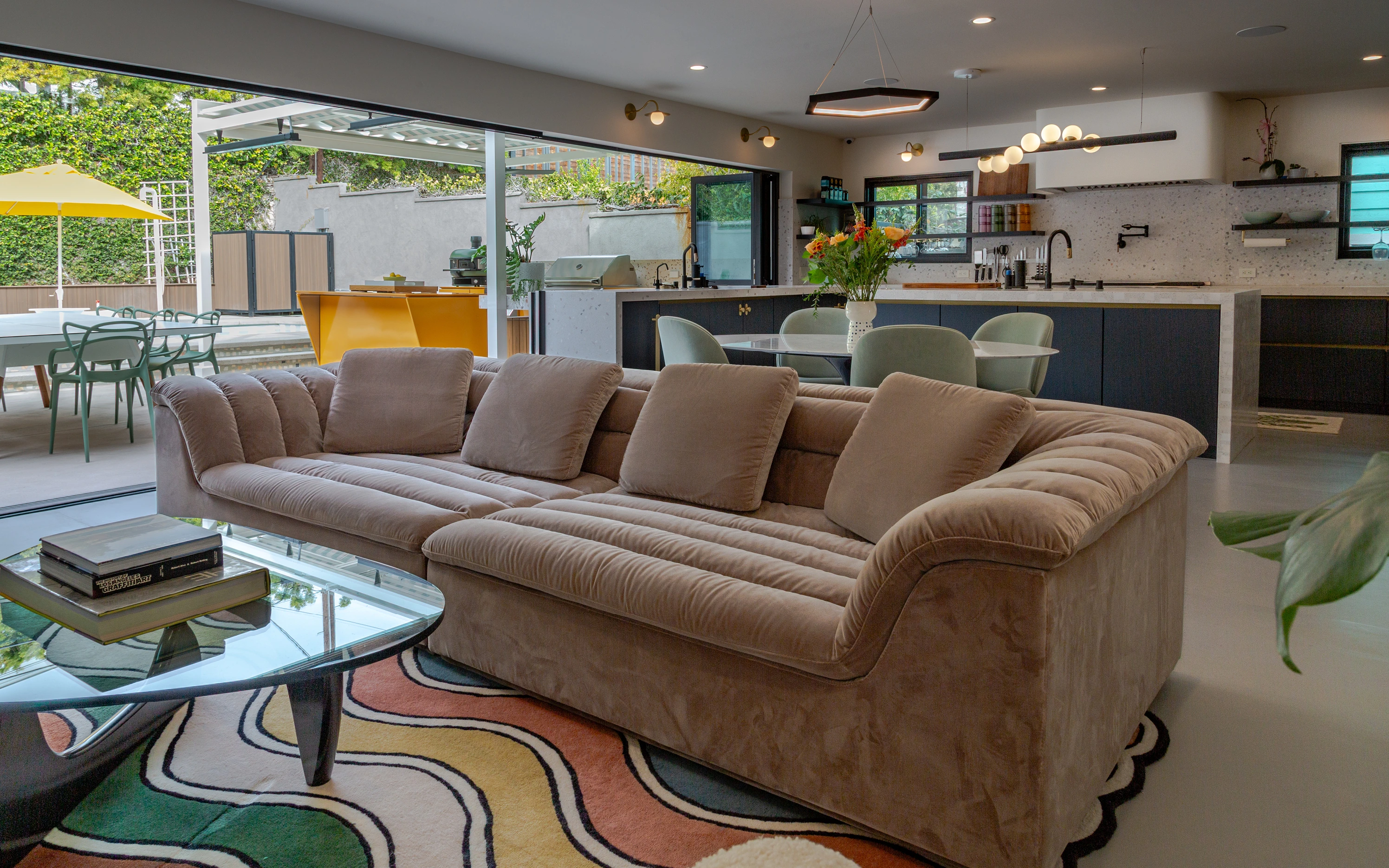
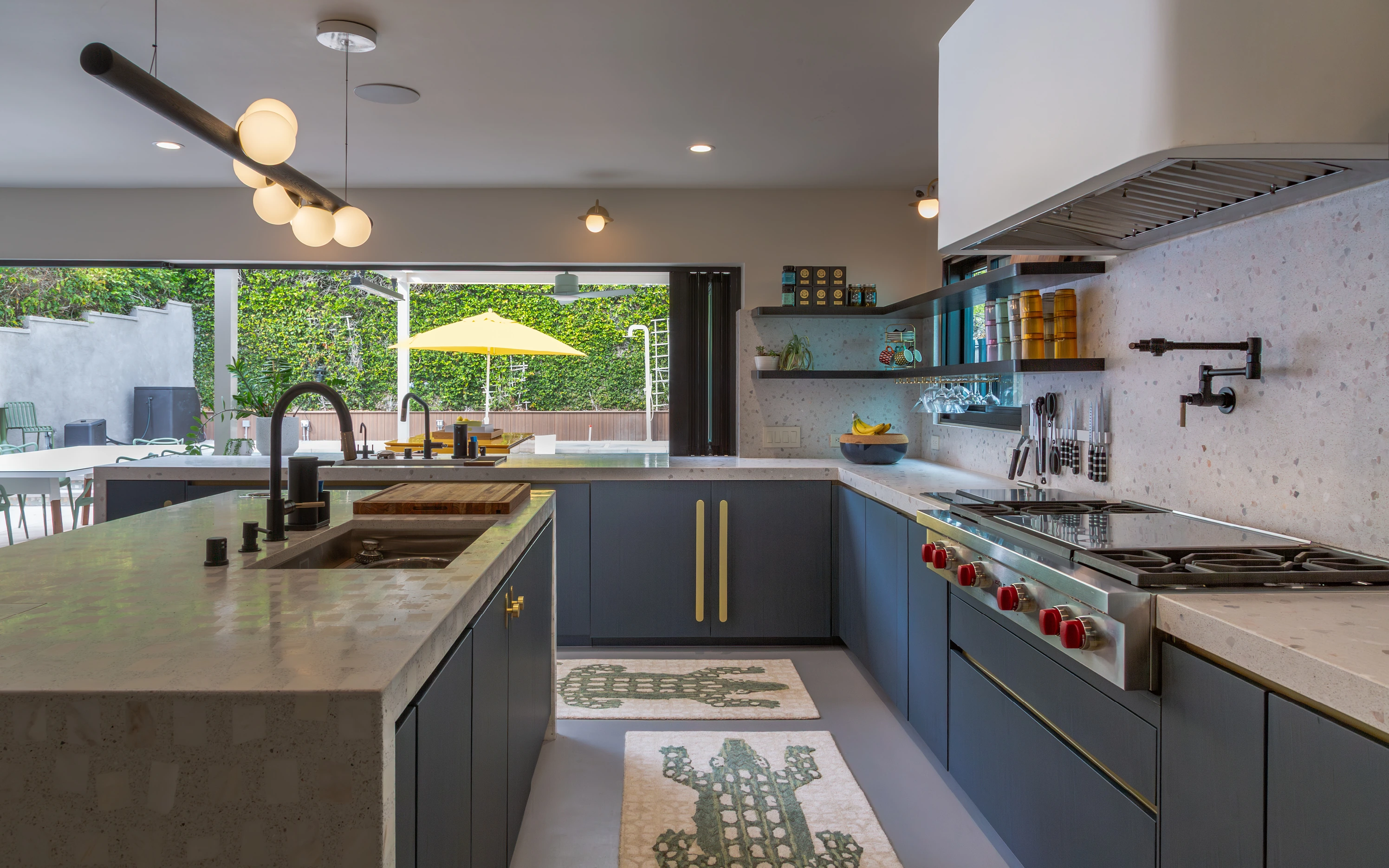
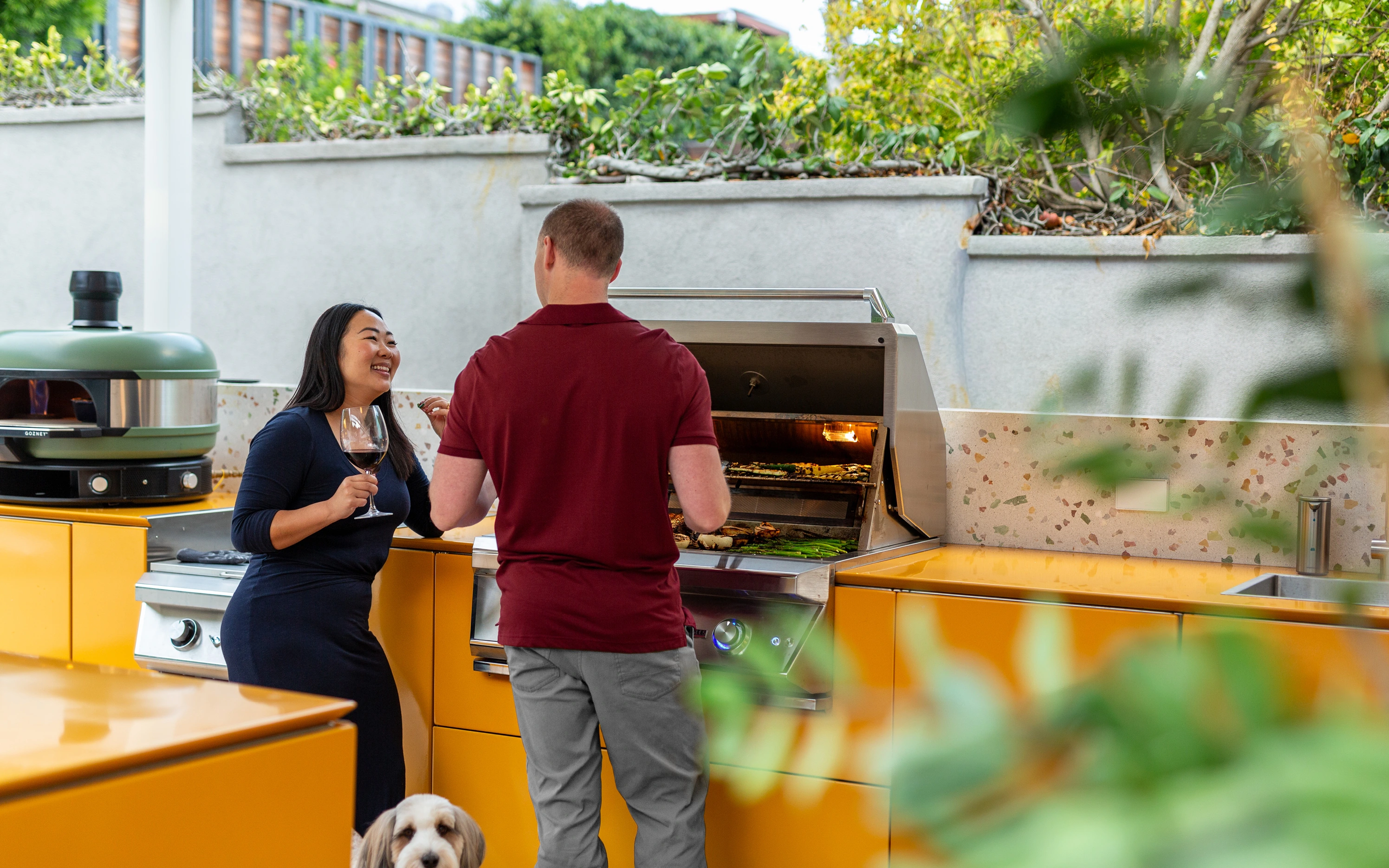
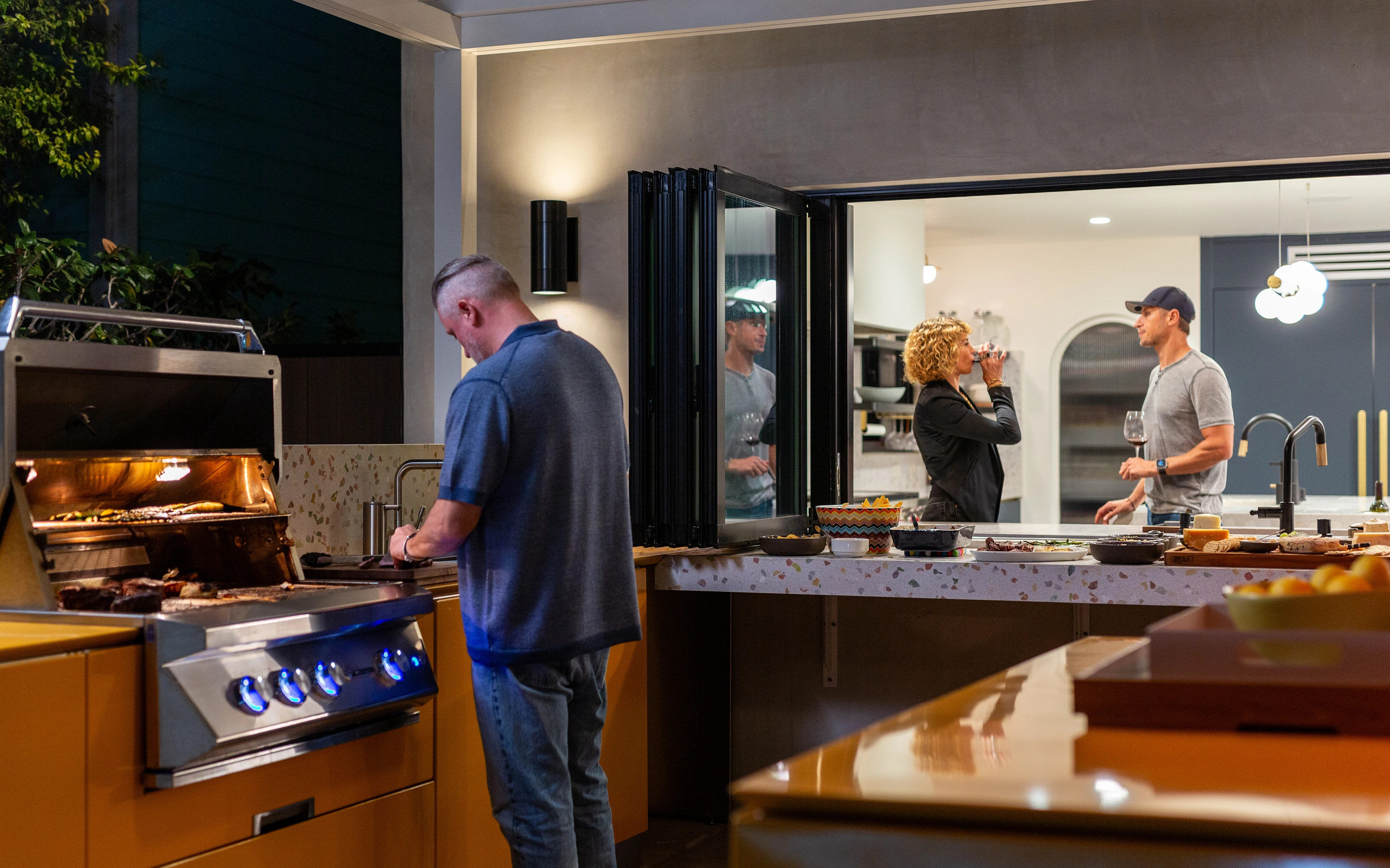
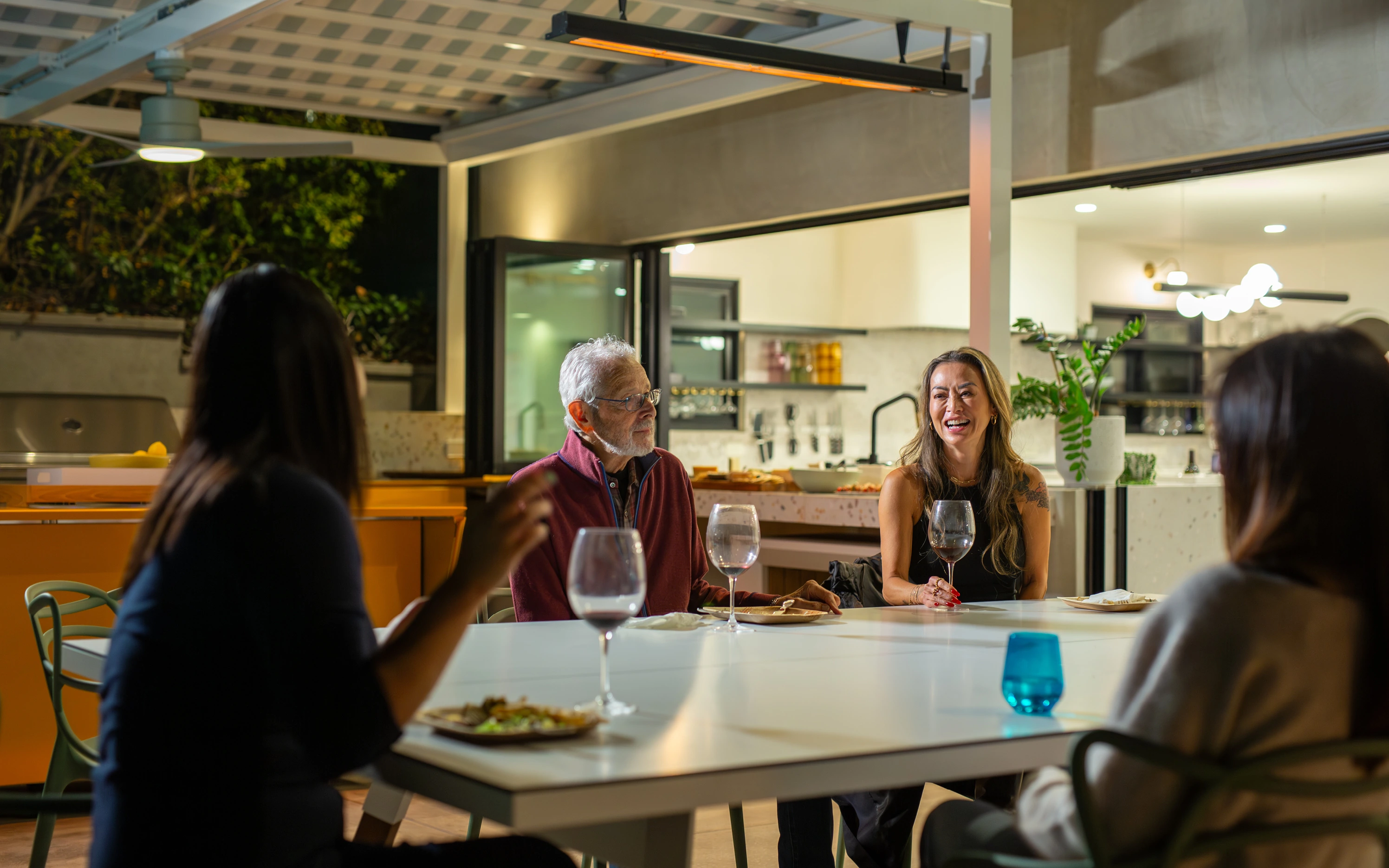
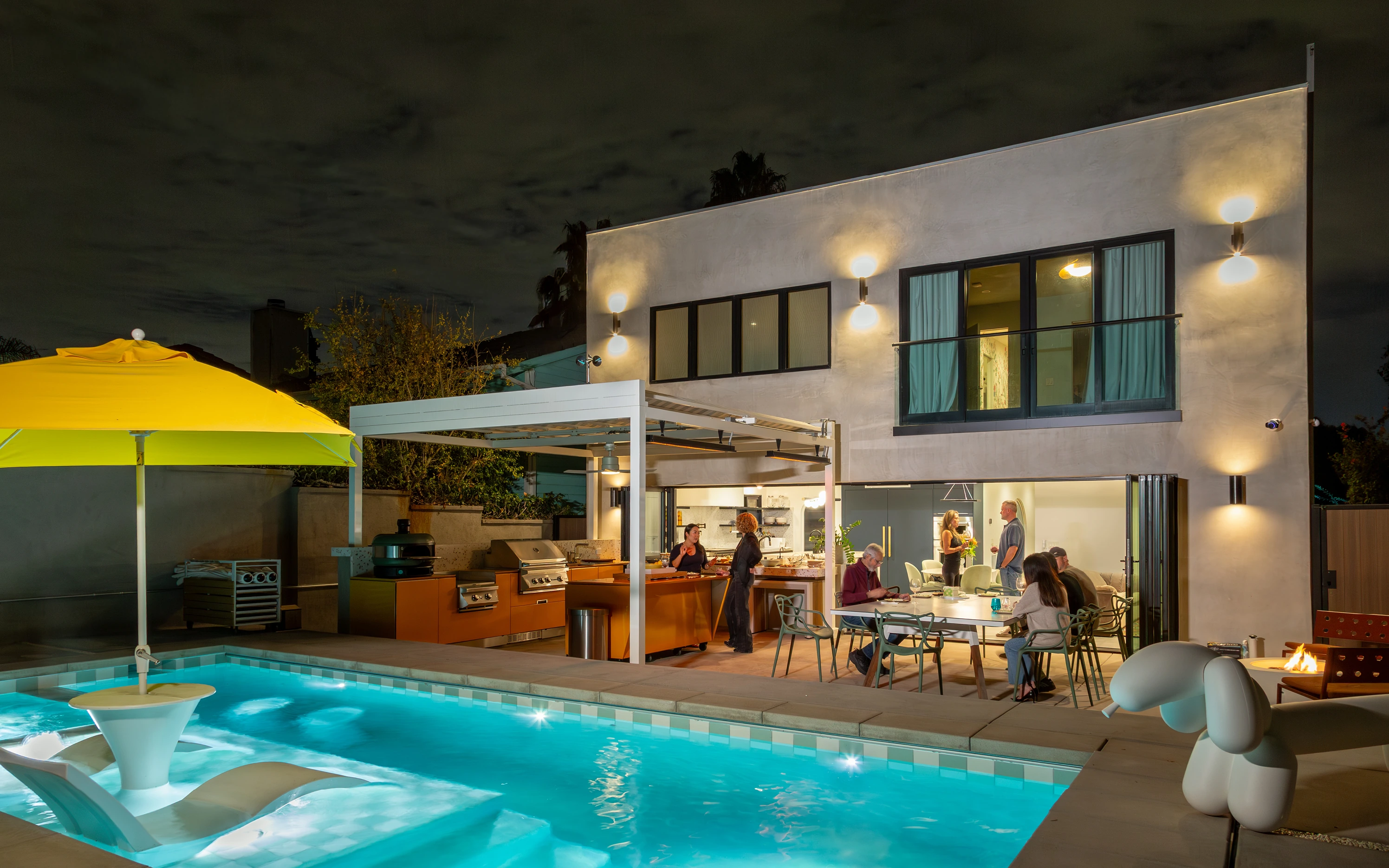
New photography by Marcelo Coelho covered both fronts: active construction sites, the team at work in their Mar Vista studio, and finished projects with real homeowners and tenants in the frame. The job's not done until someone moves in and makes it their own.
The client experience in their own words
On their new Brand Voice Blueprint, which cut a five-hour blogging job by 90%
“The output is shockingly good. Sounds just like us!”
On the Unbreakable Idea
“All Design. All Build. All the Time. That has strength. It feels like there’s experience behind it. What it evokes for me is ‘We’re the shit, and you should hire us because we know what we're doing.’ That’s the line I want to trademark.”
On the evolved logo
“I keep seeing a smiley face in the wordmark, and that’s not a bad thing. It’s strong and cheery! The new mark is an elevation for sure.”
On my creative leadership
“Can you send us that whole spiel you gave about what we’re paying you for – solutions, not options? Because we need to be saying it to our clients!”
“You have a confidence in the way you present. It’s straightforward and team-oriented. You clearly believe in what you’re showing us.”
“I appreciate the questions you ask. ‘What percentage is your buy-in at the moment – 25, 50, 75?’ It gives us the opportunity to reflect and ask ourselves how we really feel about the work.”
On the outcome
“What I like about this journey is how distilled our message has become. Getting straight to the point. People can understand who we are now, how we got here and why they should work with us.”
© 2026 Matthew Steel
Aurë Entúluva · Purpose Never Rusts