The New Walden
A self-published hardcover edition of Thoreau’s masterpiece, annotated for modern readers
When I first read Walden, Thoreau’s ideas about consumerism, busyness, and humankind’s place in the natural world struck me as uncannily relevant to 21st-century life. I shared my enthusiasm with anyone willing to listen. But I kept having to couch my recommendations: “This is a wonderful book, but the 19th-century language can be hard to digest. It’s full of beauty and wisdom, but the first chapter is a quarter of the book. But stick with it, and you’ll be glad you did!” The bevy of buts bothered me. I didn’t want to keep telling people they should read Walden – BUT ...
While Walden has always been a challenging book, language has rapidly evolved over the past two centuries, making it harder for modern readers to lock into the text.
And there was a design gap among Walden’s many editions. I went hunting for an archival copy to keep near my other favorite books. Given its status as a classic, I was sure someone somewhere had made an edition that looked and felt like a genuine reflection of the story. To my surprise, I couldn’t find one still in print – so over the course of seven years, I made my own.
Scope
Editorial Direction
Annotation
Book Design
Art Direction
Illustration
Packaging
Production Management
Publishing
Distribution
Studio
Unbroken
Contributors
Co-Editor:
Corinne H. Smith
Co-Illustrator:
Benji Haselhurst
Printing: MMC, Germany
Binding: Josef Spinner, Germany
Closing the Gaps
I found the perfect co-editor in Corinne H. Smith – a published author, poet and longtime member of the Thoreau Society.
Annotated editions of Walden already exist, some of which include abundant commentary. That’s great for academic study, but our primary aim is a delightful reading experience for newcomers and longtime fans alike.
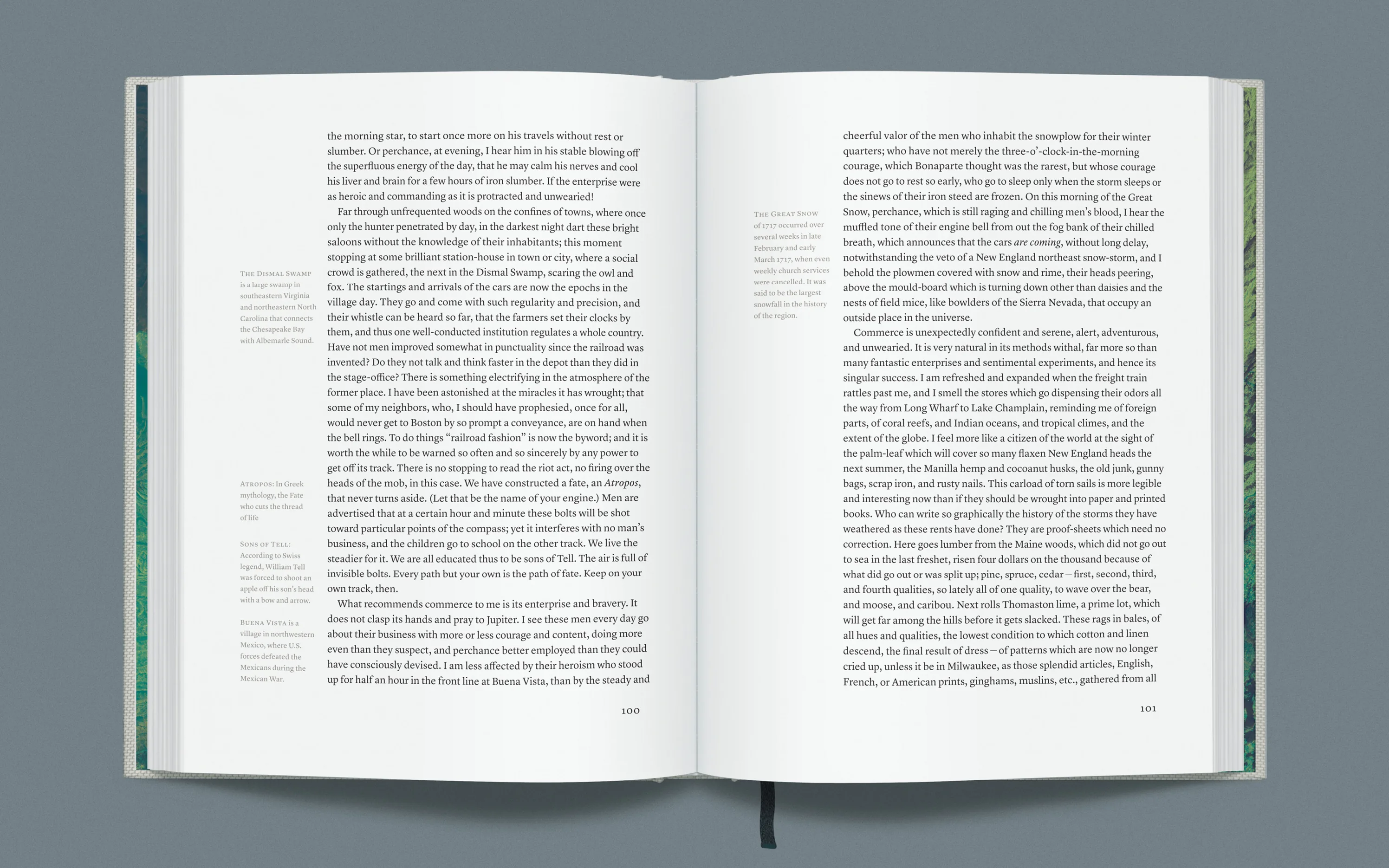
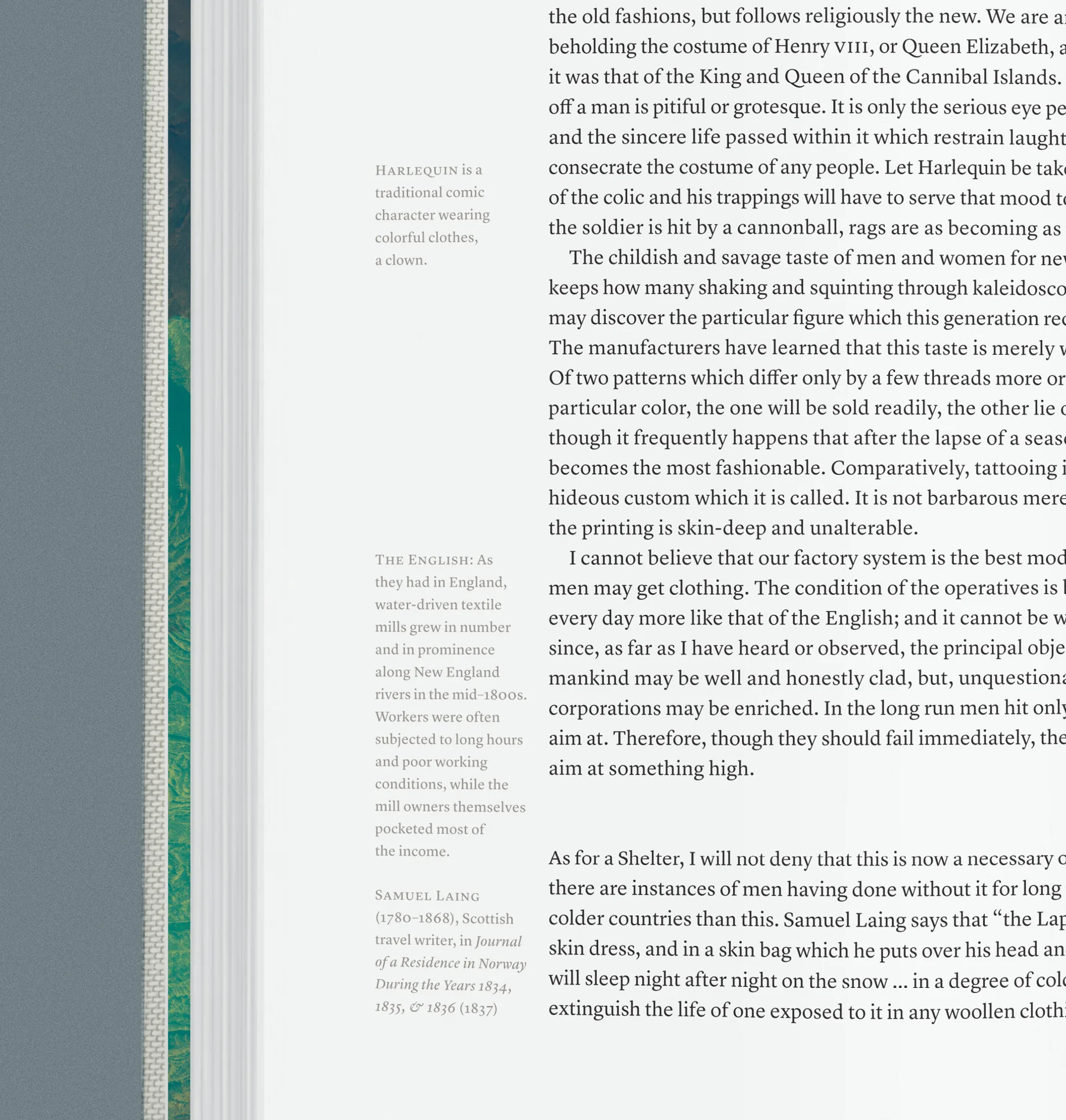
Our annotations are relatively sparse. Not a study companion, but an unobtrusive guide that leaves you alone with the text as much as possible while offering enough insight so you can keep that phone in your pocket.
Much of Walden remains accessible by today’s standards. We simply elucidated archaic words and idioms, as well as the cultural, historical and literary references that Thoreau used to embellish and connect his thoughts.
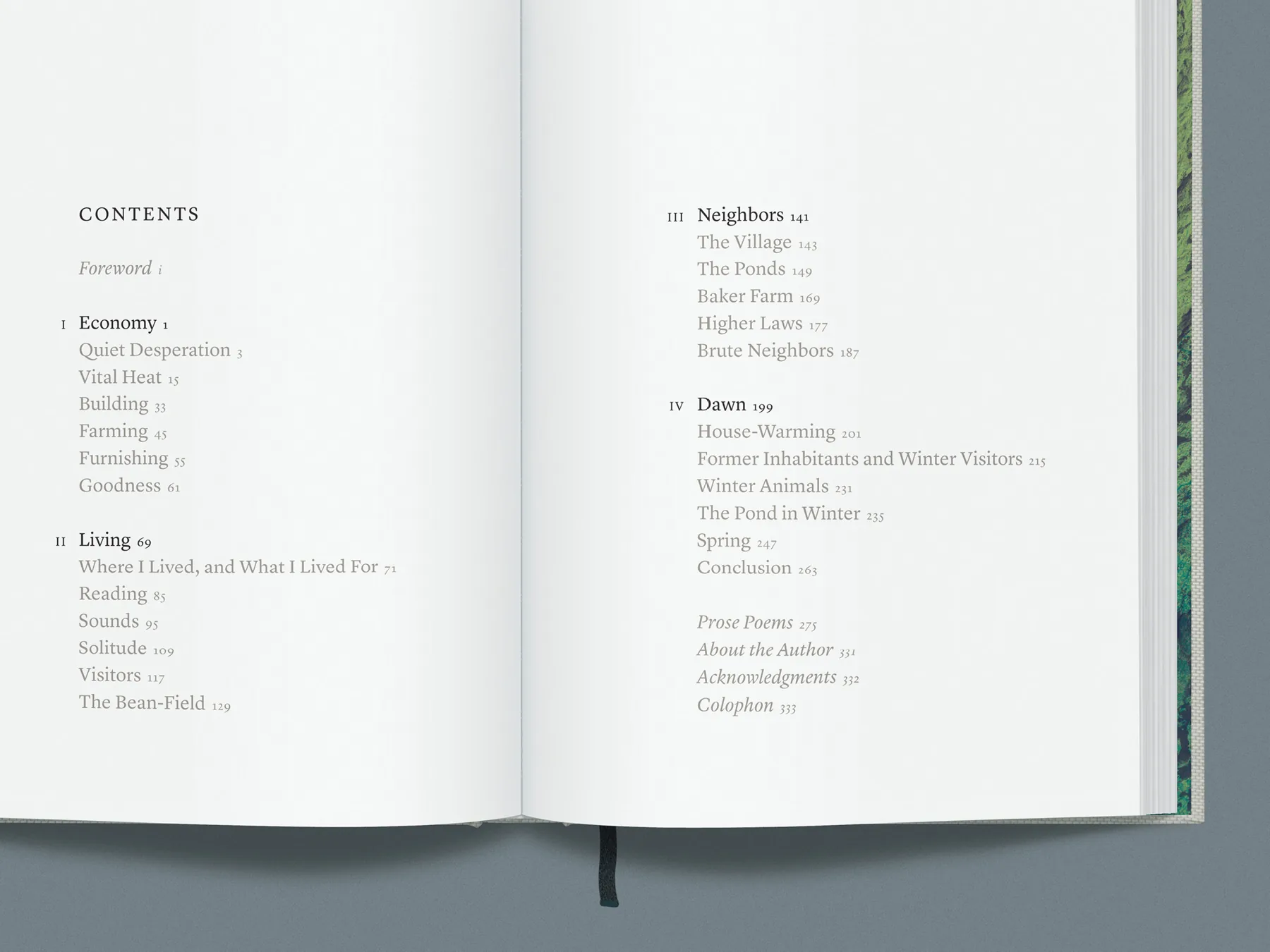
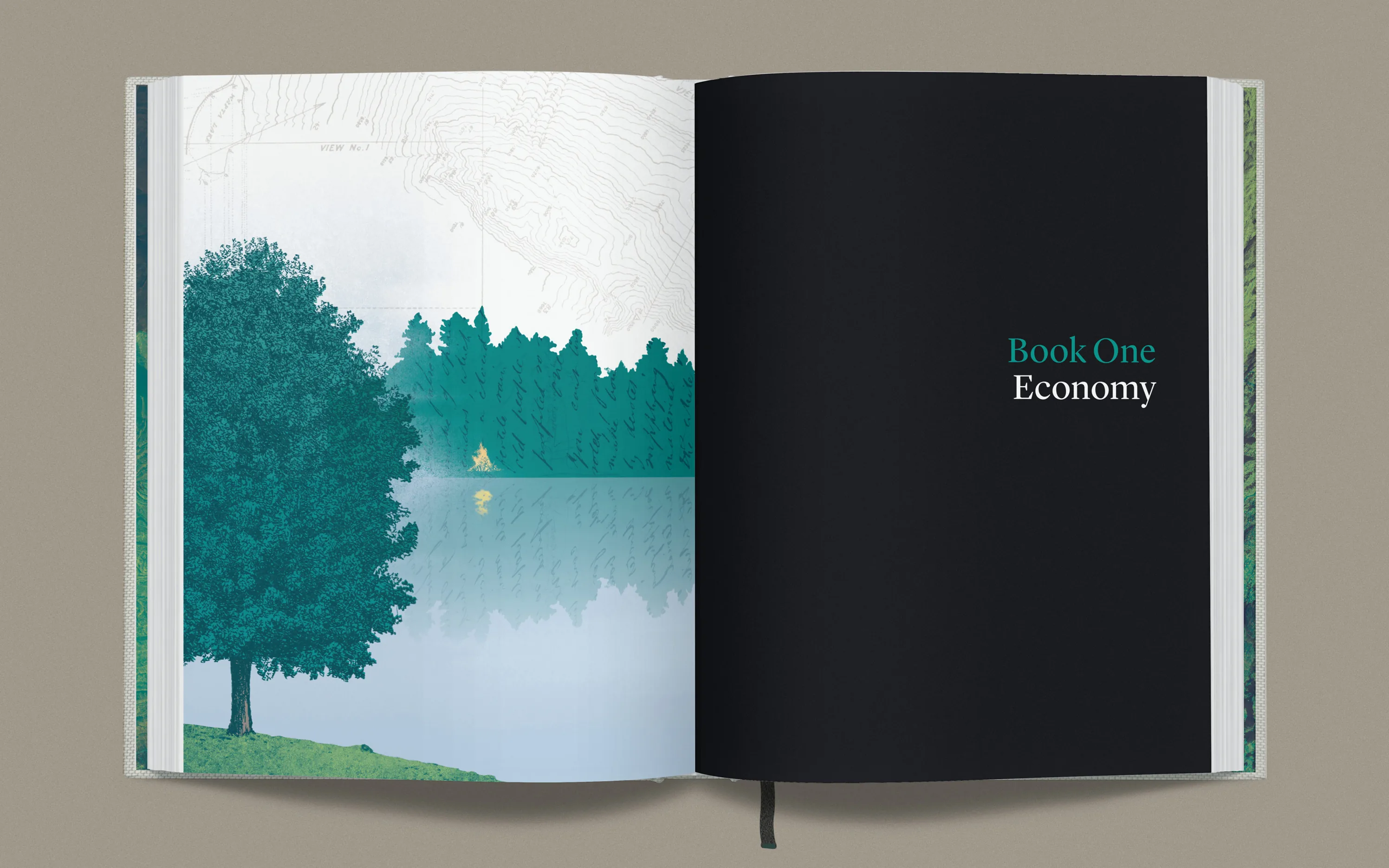
We also restructured the book without changing a word. Thoreau loosely arranged Walden to follow the progression of seasons, so we simply created four sections of similar length along discernible lines of thematic drift and gave each section or “book” its own title. And that long first chapter? We’ve turned “Economy” into the first book and broke it down into six chapters, yielding twenty-three chapters of similar length. The new structure creates a more sustainable pace and a better rhythm.
Timeless by Design
A well-designed book tangibly reflects the story and the author’s values. Thoreau was an early advocate for conservation, and sustainability is critical to this project. From cover cloth to paper and ink, all of this edition’s materials are high-quality, archival, durable and responsibly made.
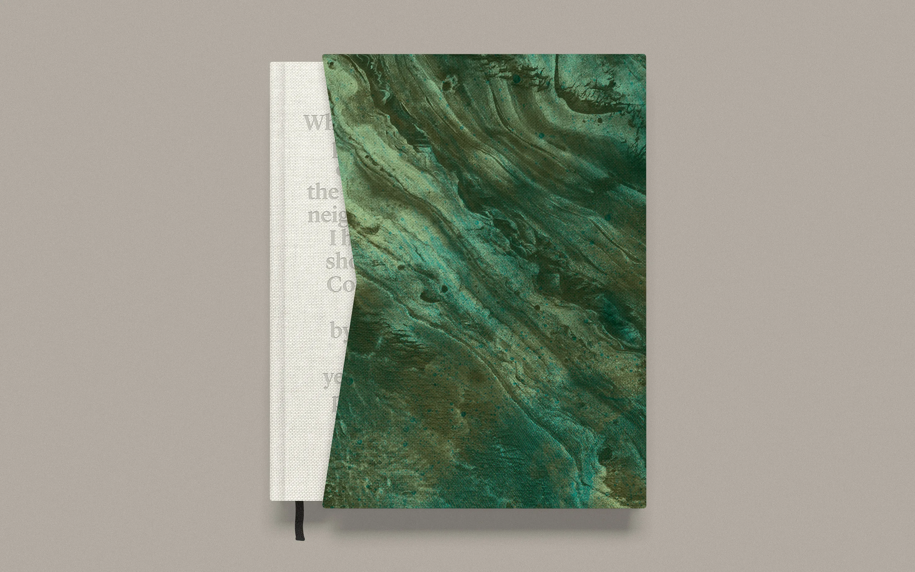
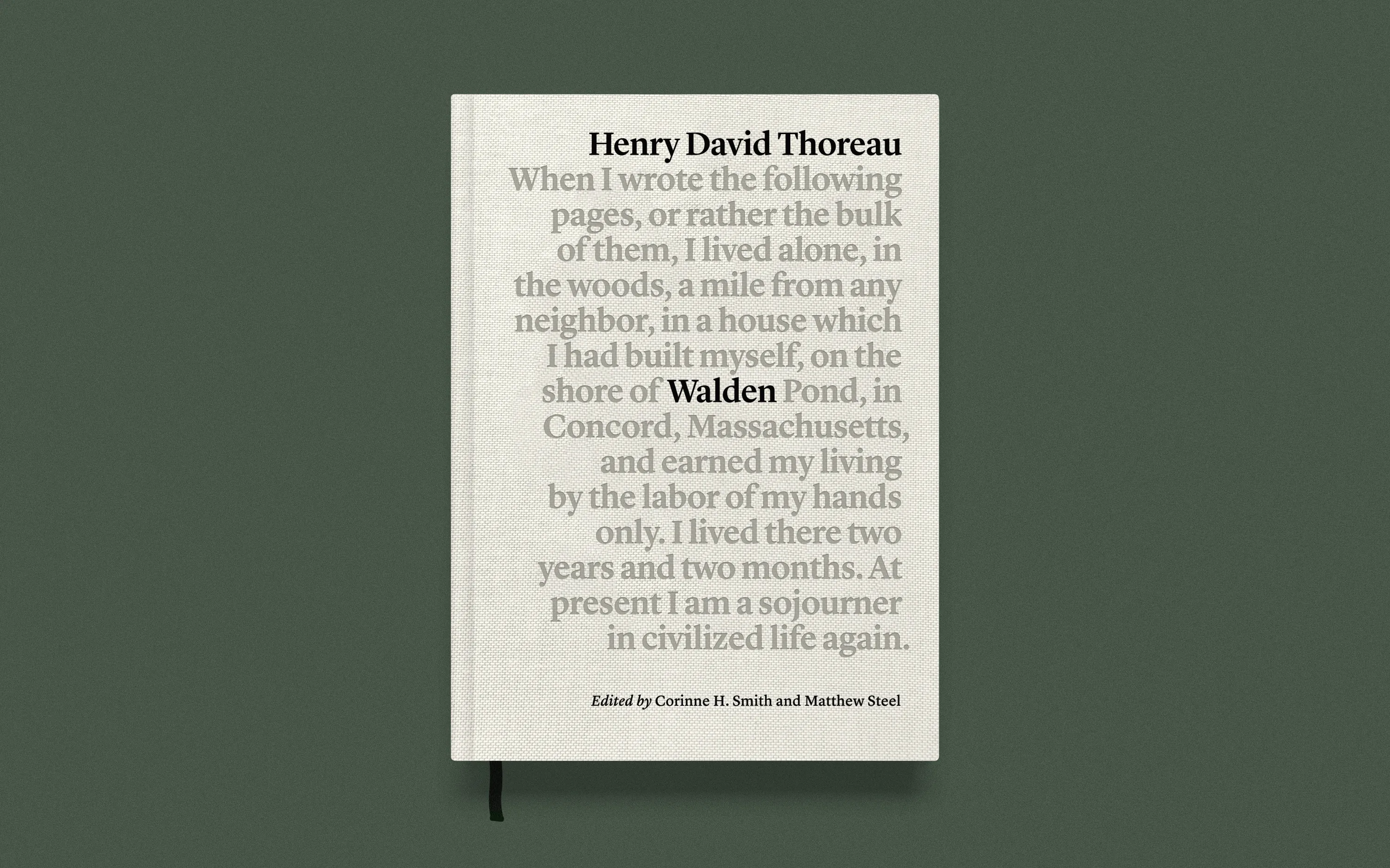
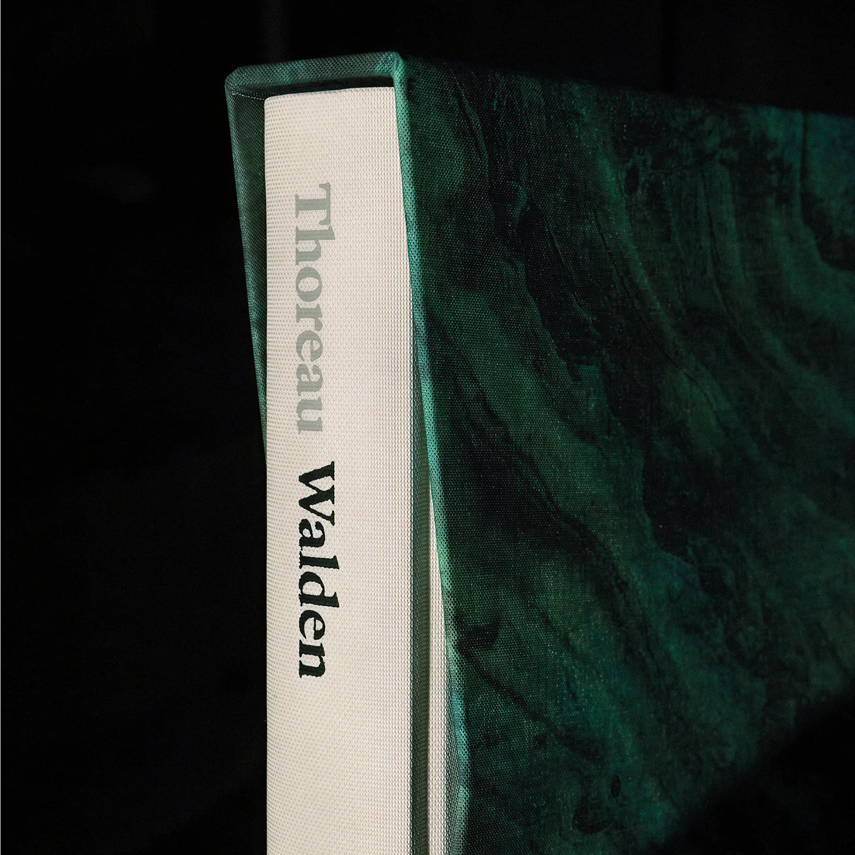
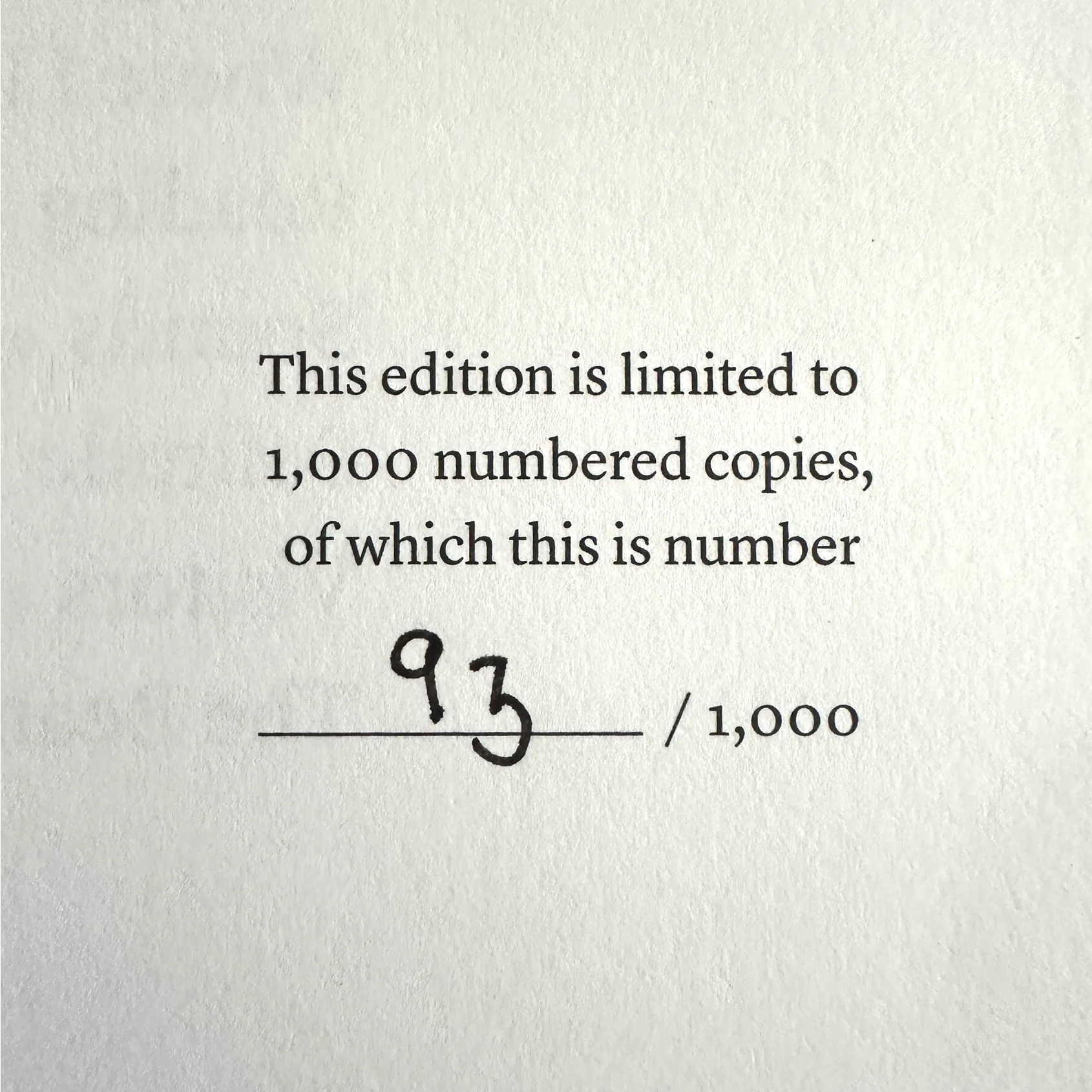
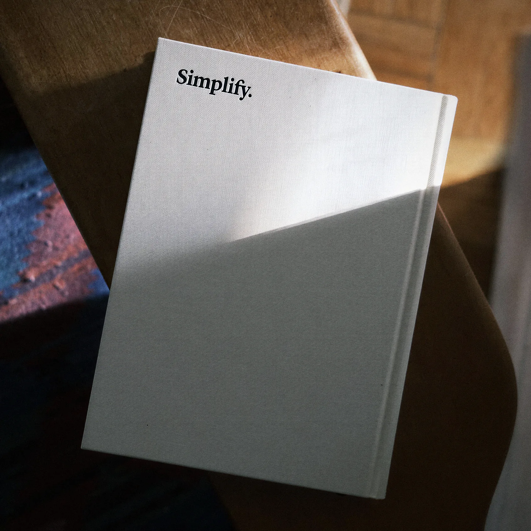
Organic cotton covers. FSC-certified paper. Sewn binding with a rounded spine that falls open in the hand and lasts far longer than glue and flat spines. Two-color foil stamping. Black cotton ribbon. Printed clothbound slipcase with 360-degree continuous artwork wrapping across all facets. Hand-numbered. Printed in five colors by Memminger MedienCentrum, bound by Josef Spinner – the same German duo trusted by The Folio Society and Writ Press.

Library Punk
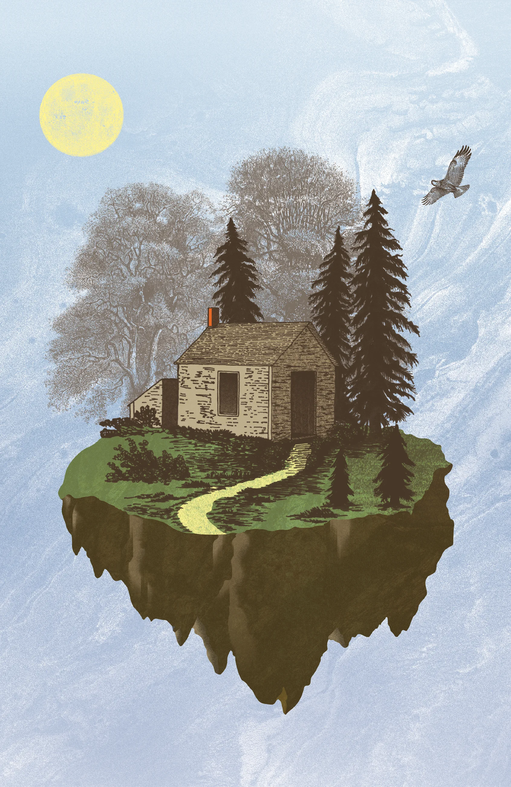
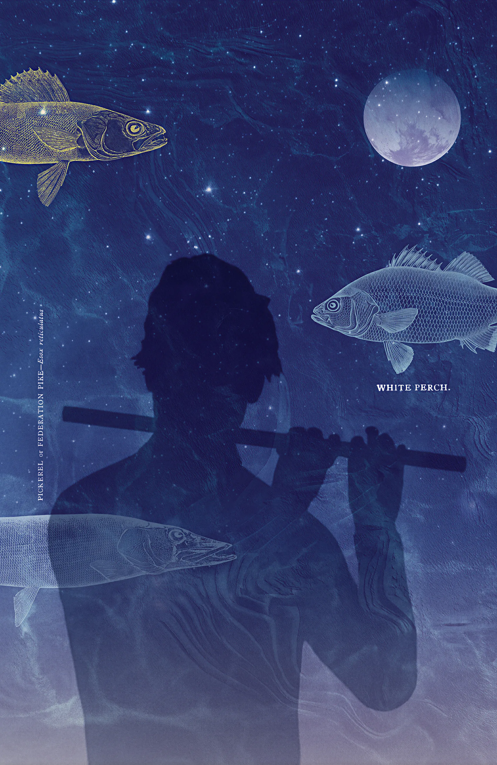
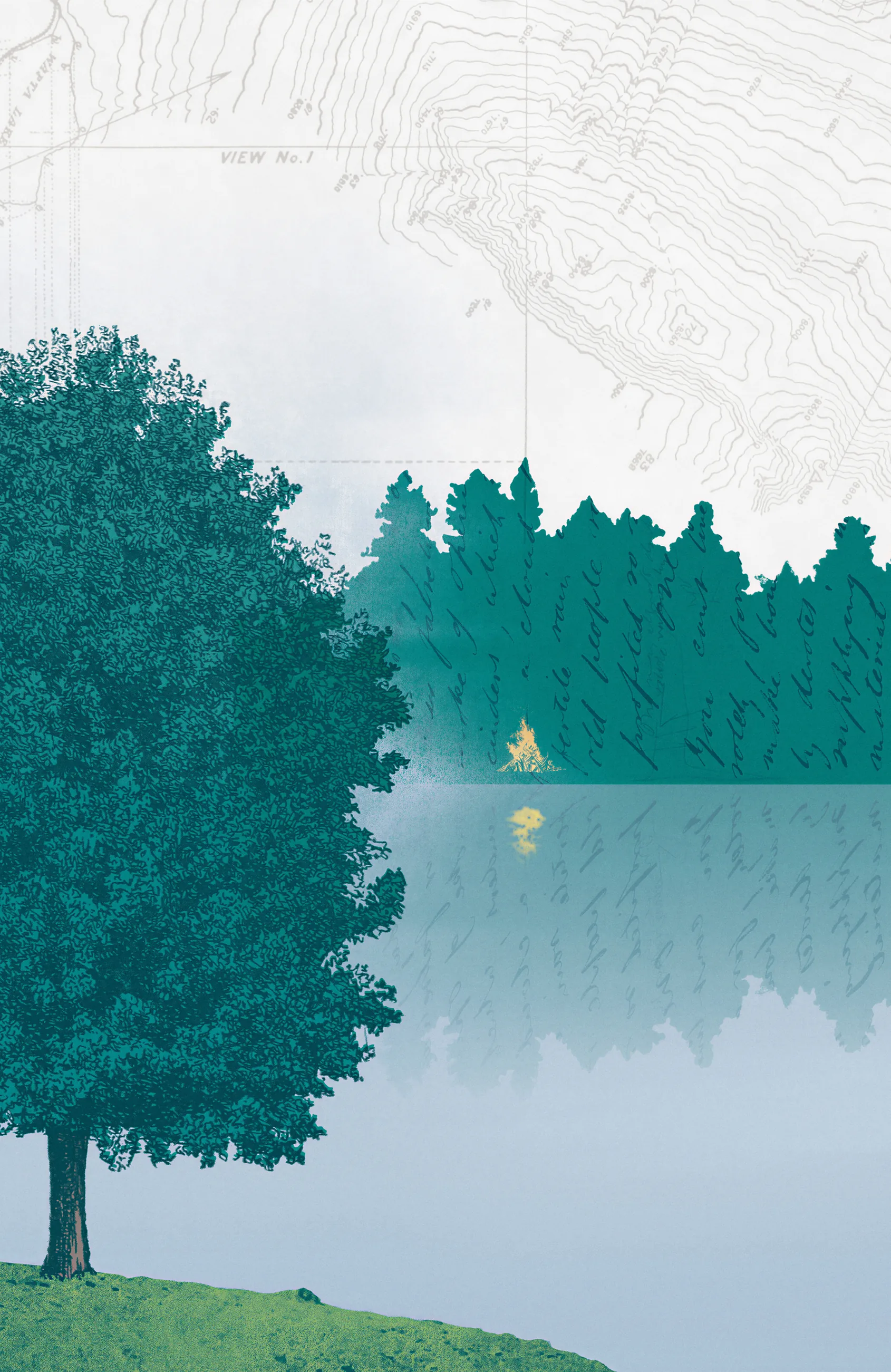
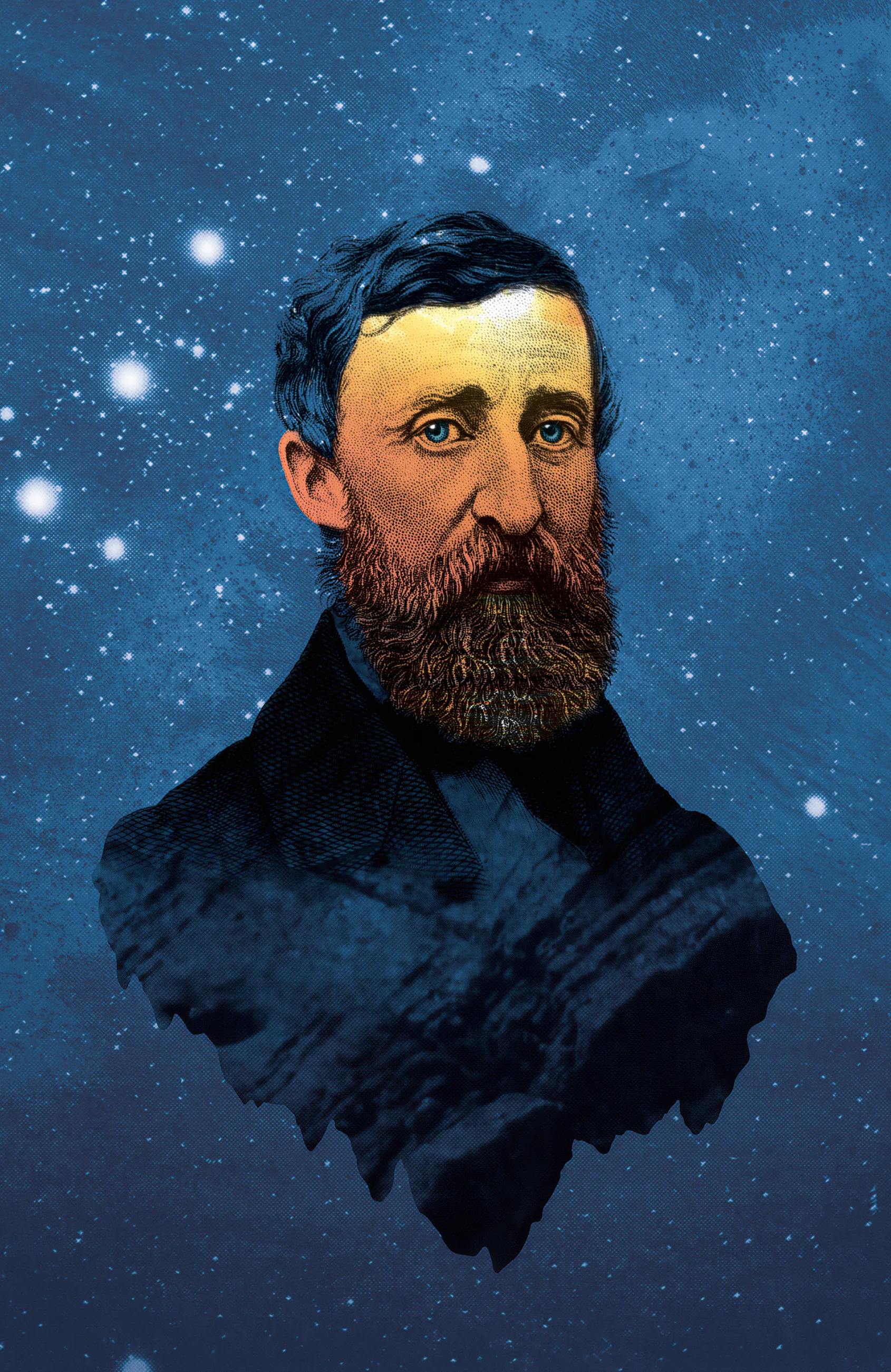
For the four full-color illustrations, I gathered images from open-source archives and combined them with my own drawings – scenes that blur the line between the material and the imaginative. Thoreau was a bookish scavenger himself, so the approach fit.
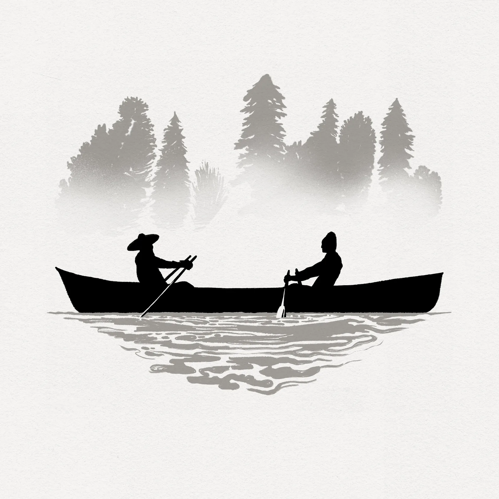
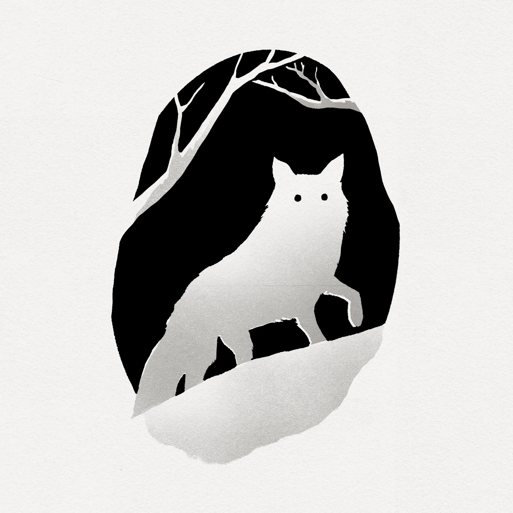
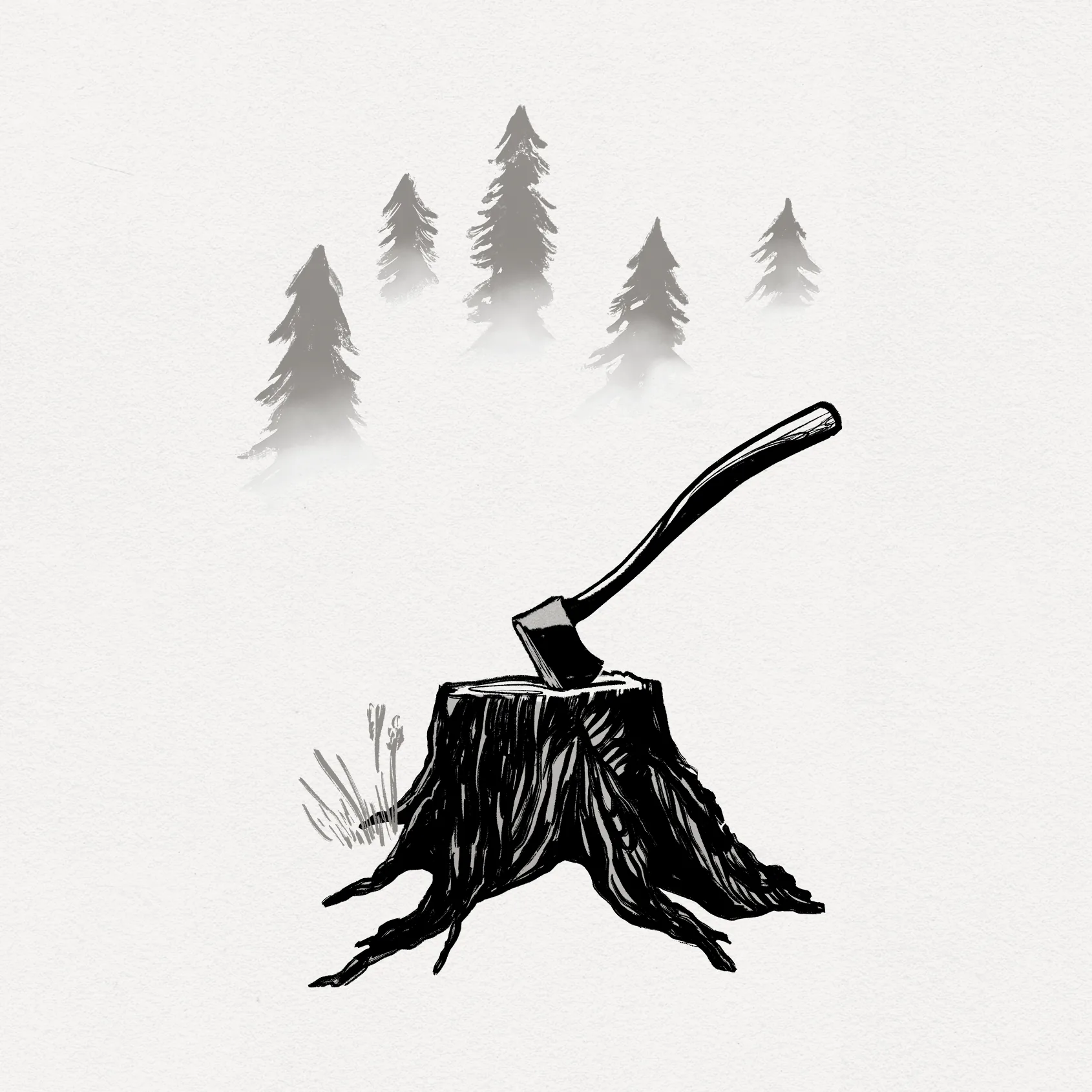
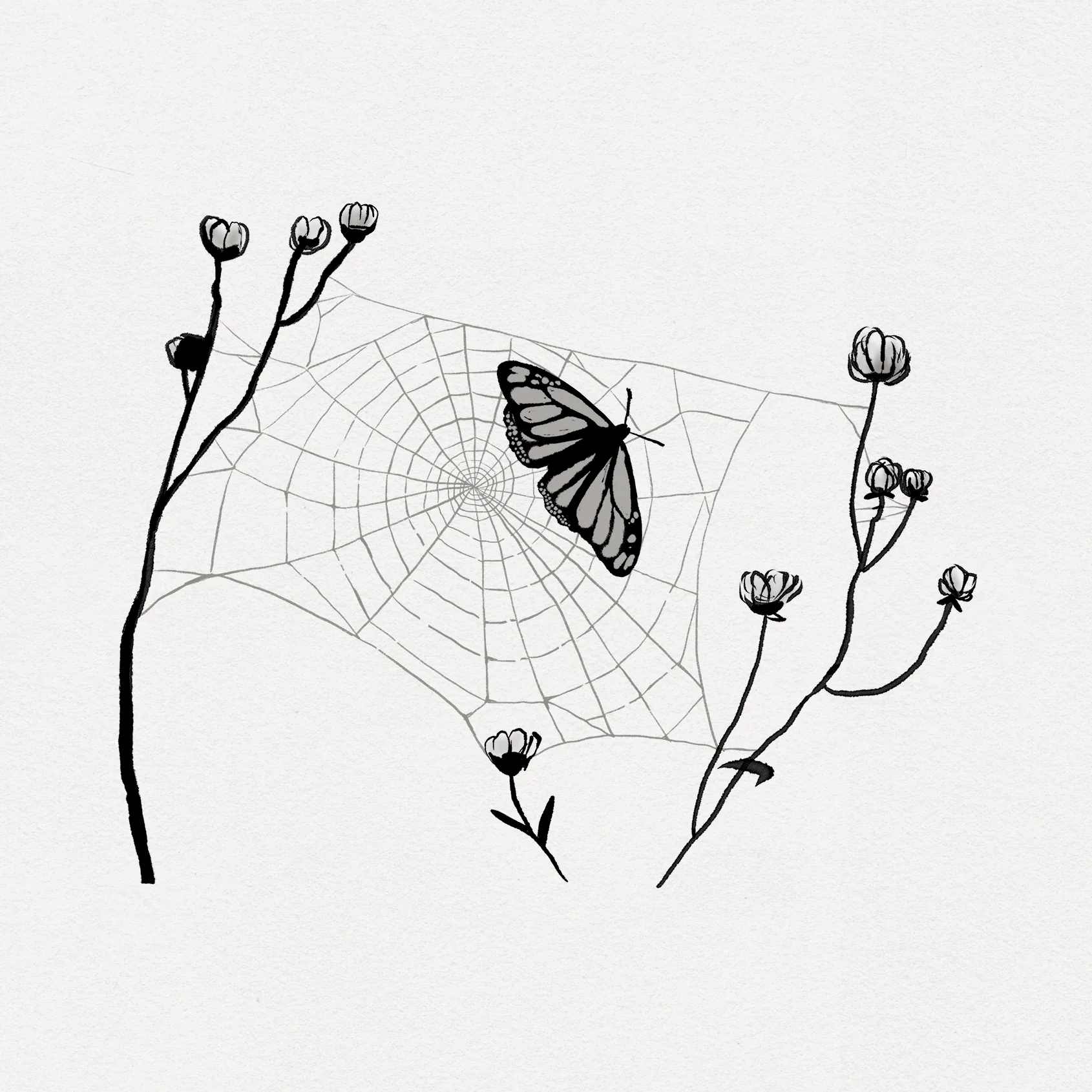
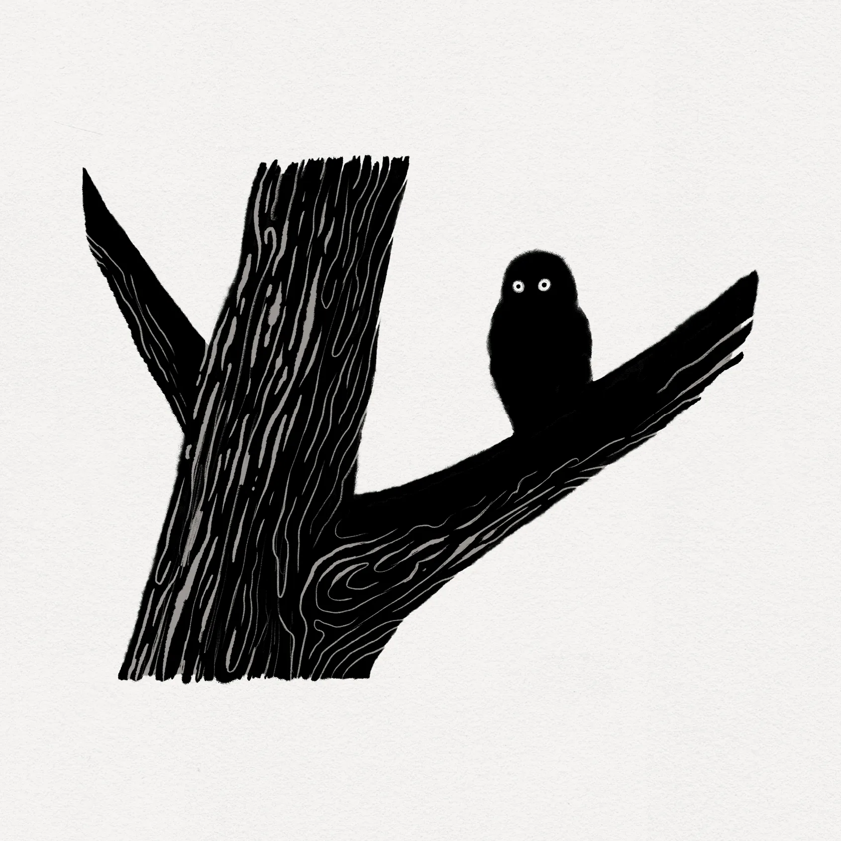
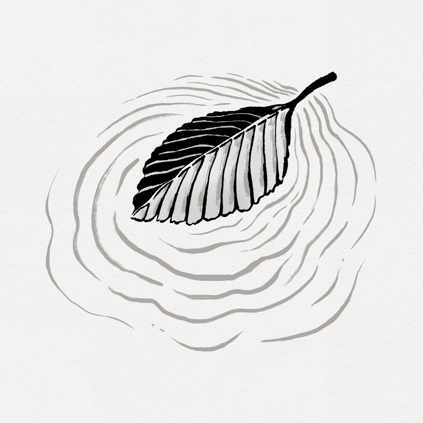
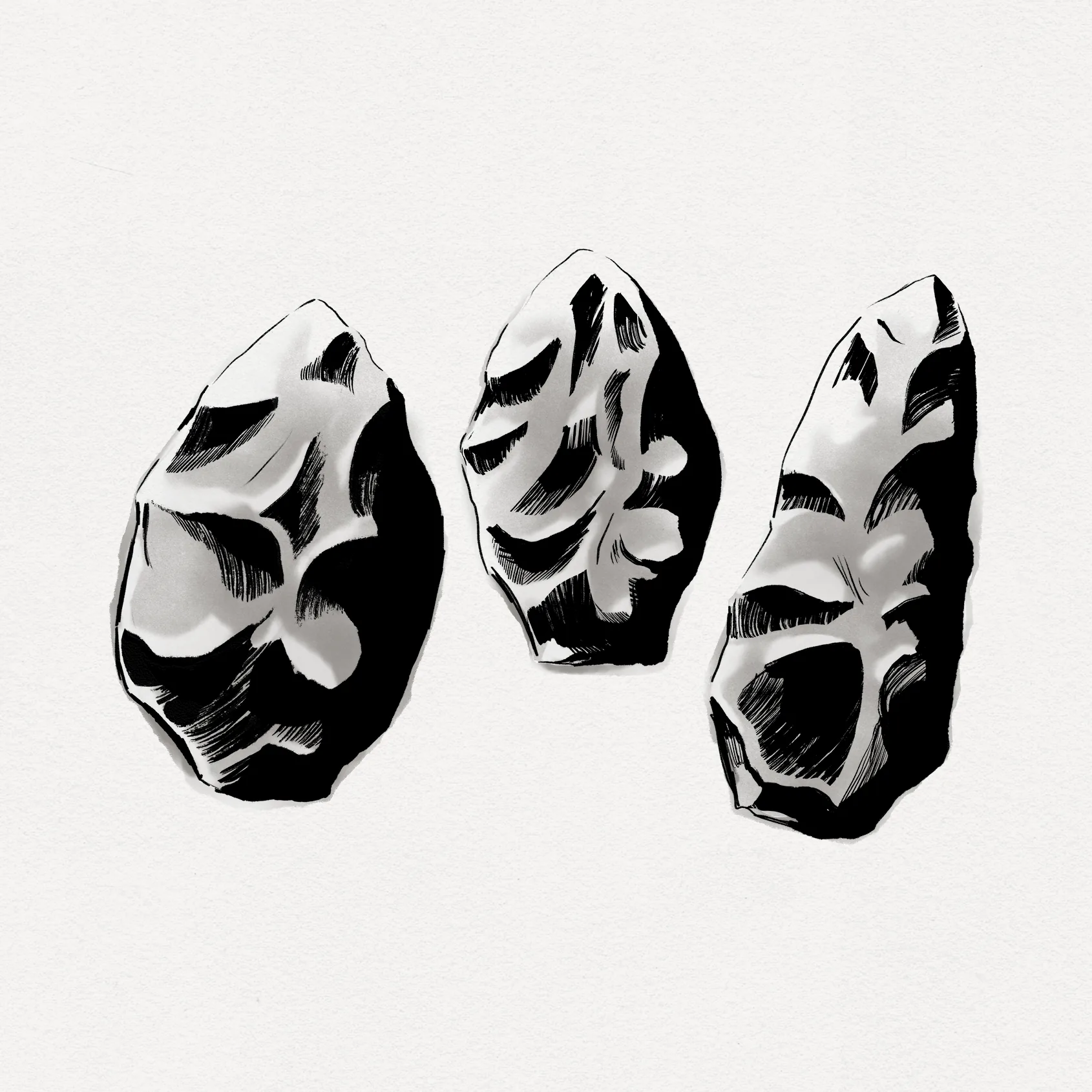
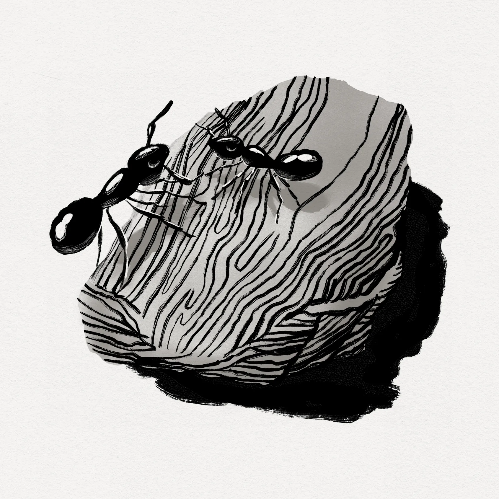
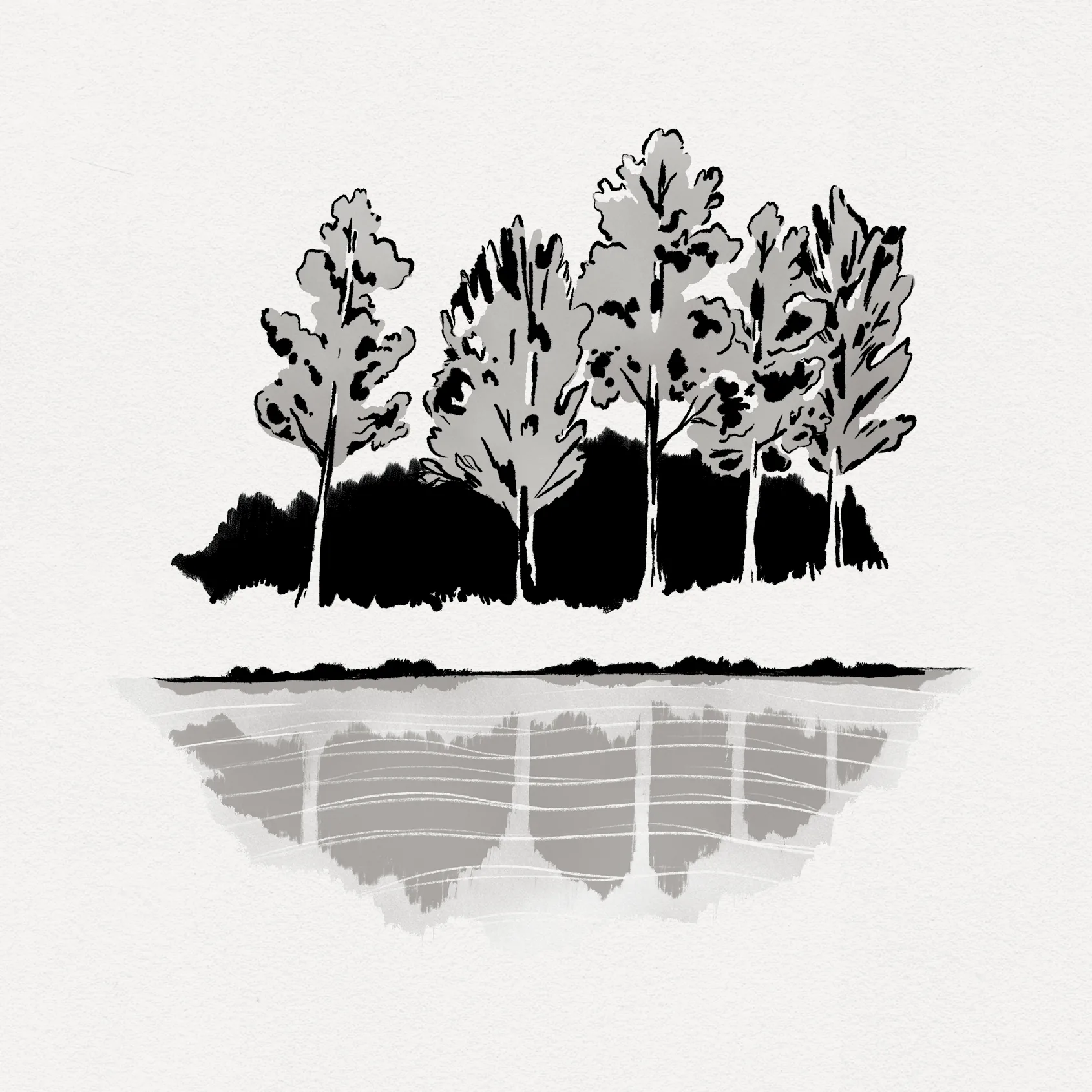
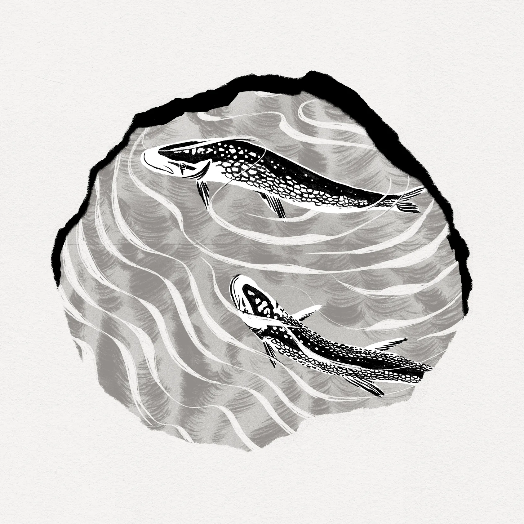
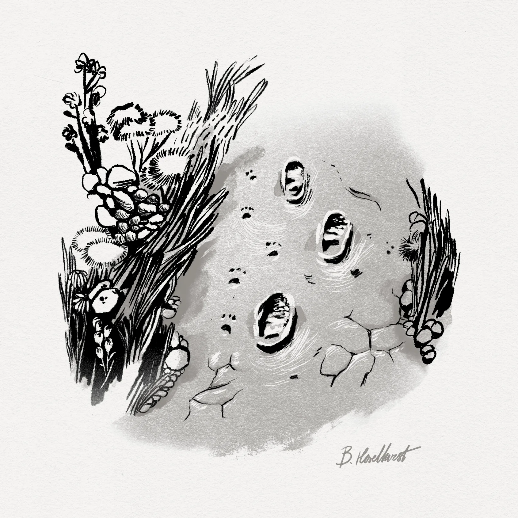
A colleague and dear friend, Benji Haselhurst, drew a series of twelve two-color illustrations that are scattered throughout the book. We took inspiration for these minimal, evocative images from Thoreau’s own sketches in his journals.
I made the slipcase and endpaper images by digitally painting and interweaving public-domain photos taken by NASA’s HiRISE camera. That’s not a picture of New England granite, nor is it even on planet Earth – it’s Mars! Thoreau wrote that his cabin felt “as far off as many a region viewed nightly by astronomers. ... I discovered that my house actually had its site in such a withdrawn, but forever new and unprofaned, part of the universe.” So we put him there.
A two-page reproduction of the Walden Pond map from the 1854 first edition of Walden – surveyed and drawn by Thoreau – rounds out the imagery.

Simplify, Simplify
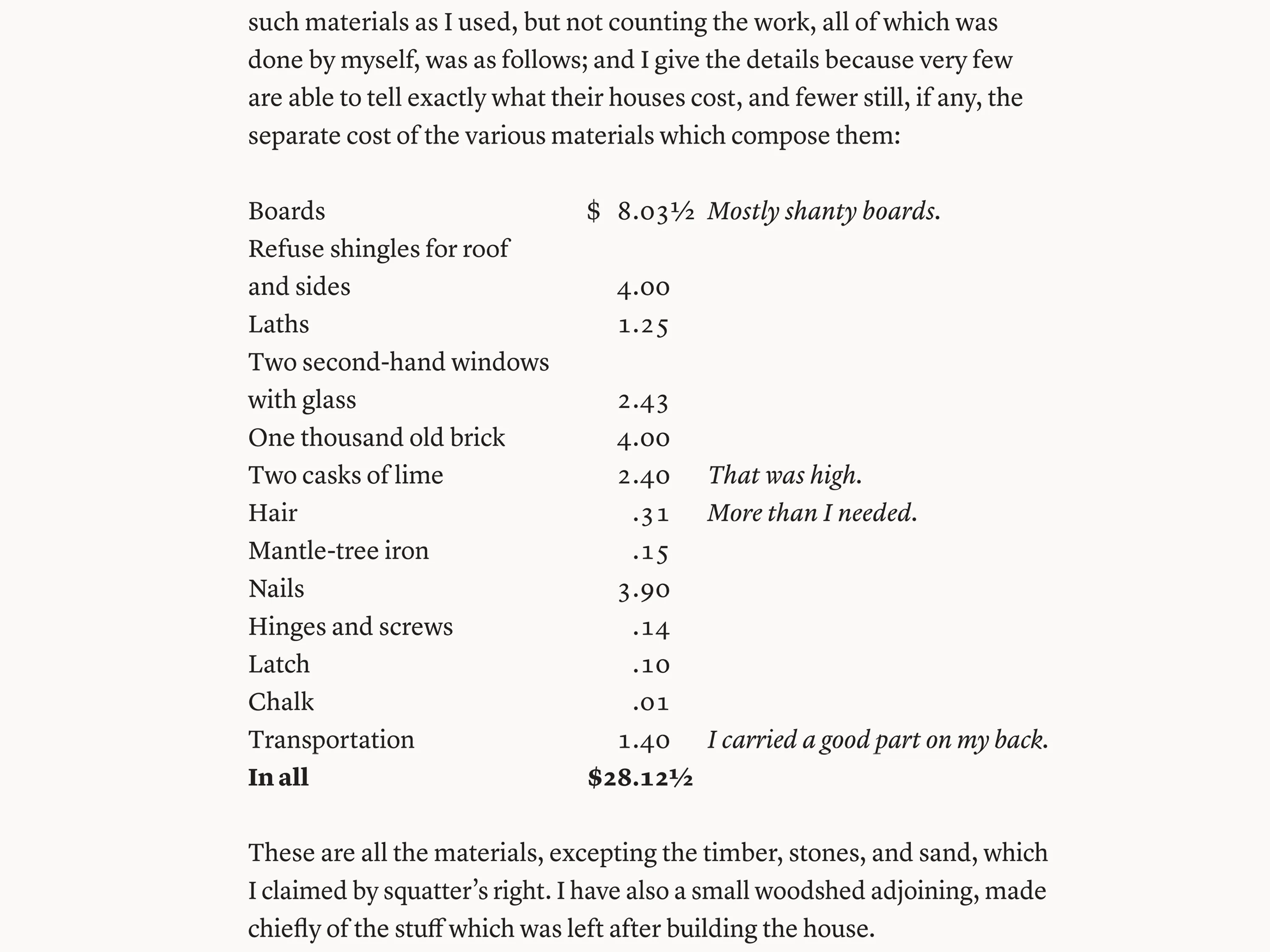
I tested period typefaces and passed on all of them – too stiff or too ornate. Thoreau had French Huguenot ancestry, and I wanted something efficient with a little Gallic flair. Lyon Display and Lyon Text from Commercial Type fit the bill. One family, every page. Ideal for a book about living a full life with less.
Poetry Hiding in Plain Sight
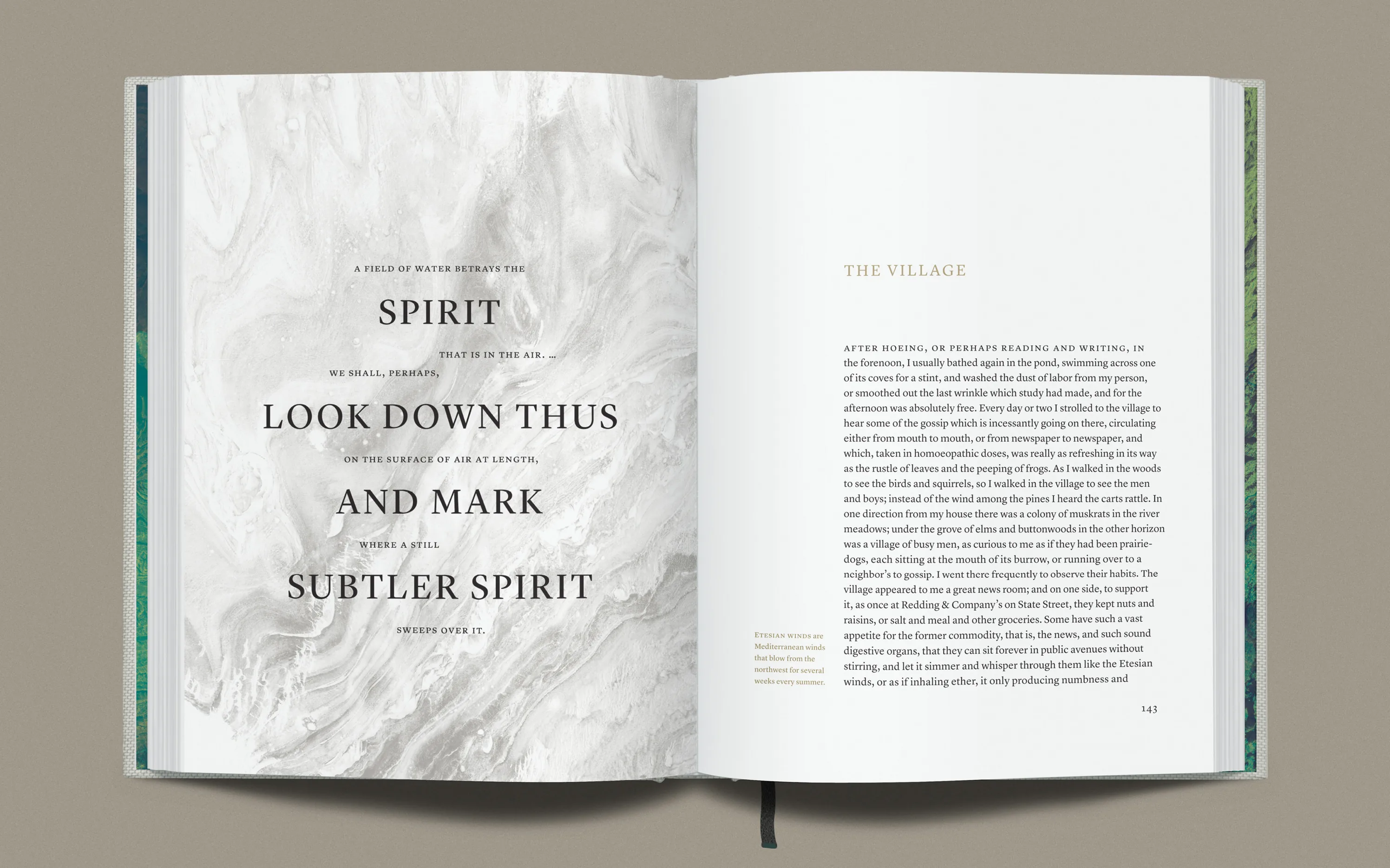
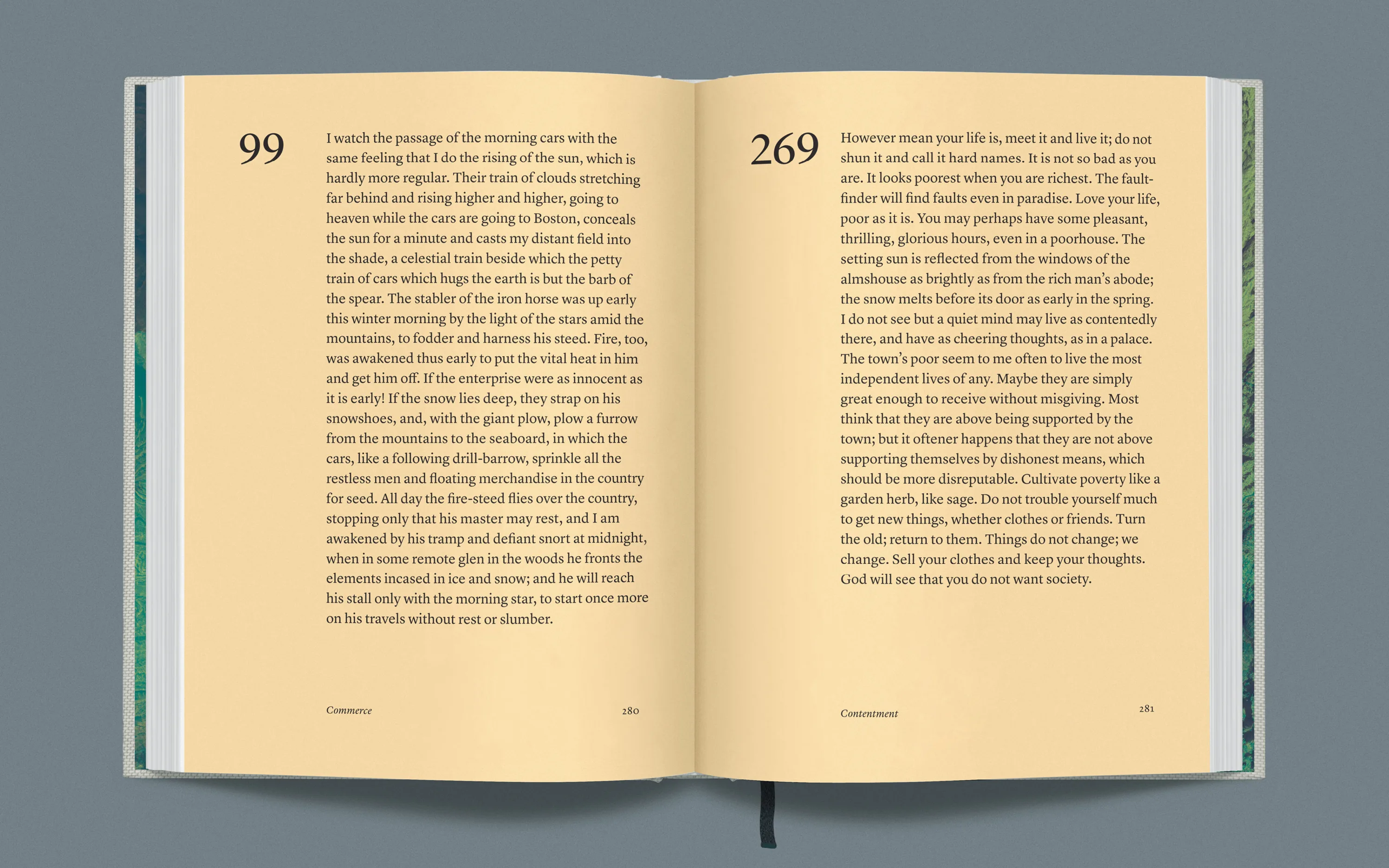
Thoreau was a poet, but his best poetry was hidden in his prose. This edition features a curated selection of Walden’s most lyrical passages, presented as prose poems and arranged by theme – 23 themes for 23 chapters (the symmetry was accidental!), ranging from appreciation and awakening to living in nature, local wilderness, simplicity, solitude and more. By setting these selections in prose form rather than lineated verse, we maintained the original format while highlighting each passage’s aesthetic.
Love Makes You Do Crazy Things
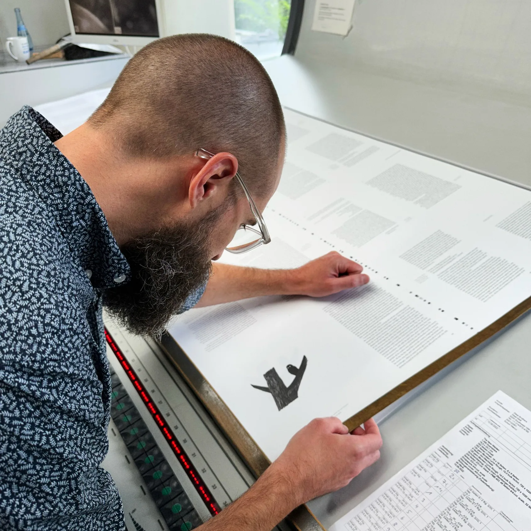
Hefty, but light enough to hold in one hand. Paper texture and opacity just right. Firm, deepish deboss on the foil. A rounded spine that falls open flat. Crystal-clear text, with every paragraph in the entire book shaped by hand for an unobtrusively organic ragged edge. A reading experience that’s both meditative and lively.
All it took was seven years, a failed Kickstarter, a cross-country move, three career changes, one pandemic, 460 backers for a bootstrapped crowdfunding campaign, three days of press checks, one very generous investor and one very patient wife.
What readers say
“Stunning. Everything is so well-designed, right down to the shipping box. It invites reading rather than just admiring on the shelf.”
“So user-friendly and intelligently designed it will quickly become your reading copy of Walden, as it has become mine.”
“There’s a lot more to it than you find in many of the Folio Society editions these days.”
“This has been created with lots of thought, love, and care, which is the most that Mr. Thoreau could’ve wished for. Well done.” – Stefan Sagmeister
Still available while copies last.
Get yours →
Copyright 2026 Matthew Steel
Aurë Entúluva · Purpose Never Rusts